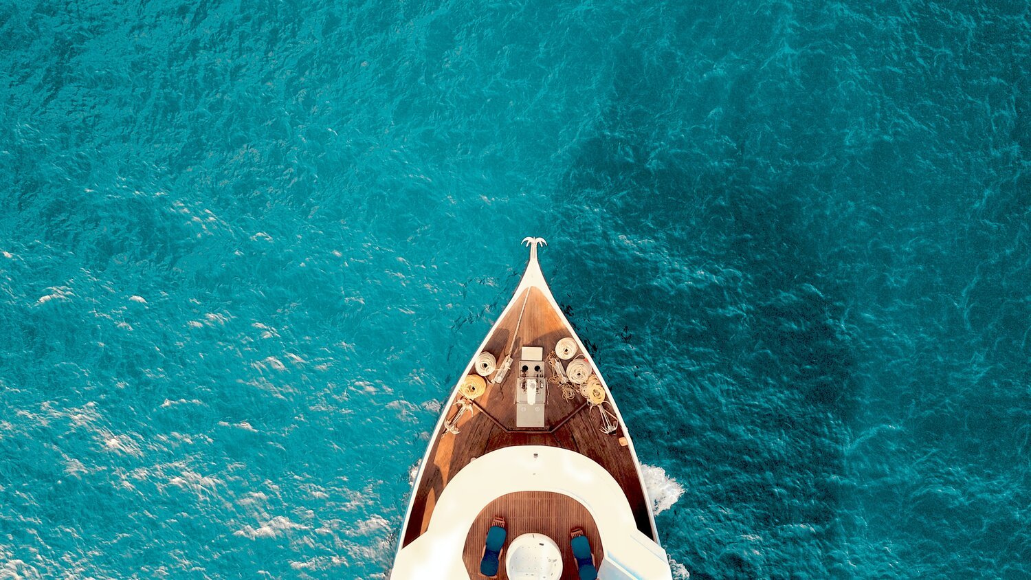
Uncorking London-based luxury
What’s the Evening Standard?
Founded in 1827, the Evening Standard is London’s most iconic news brand and the UK’s largest quality daily newspaper. The paper itself is free and as iconic to Londoners as any large clock, glass ferris wheel or the stalwart belief that you mustn’t speak on the tube.
The brand reaches a total of 18 million cross-platform readers a month with 2.6 million daily cross-platform readers.
Currently it sits within the media group ESI Media alongside The Independent which I also worked across. See that work here.
Evening Standard Insider
Early on during my time at ESI Media (Evening Standard & The Independent) I was approached by members of senior editorial staff to create the visuals for a brand new luxury lifestyle platform for the Evening Standard – Insider.
Over the course of six months, I created the entire brand from the ground up, designing the logo, UX & UI of the site, as well as the image processing technique seen across the whole website, all social and print products.
During the project, I also collaborated with Harrods and Sky building Insider’s reputation with global clients through editorial partnerships and sponsored marketing content.
Elevator points:
Designed entire site and brand
Created image processing concept based on a content-leading-colour approach
Worked alongside senior stakeholders to help shape and direct the site structure and content
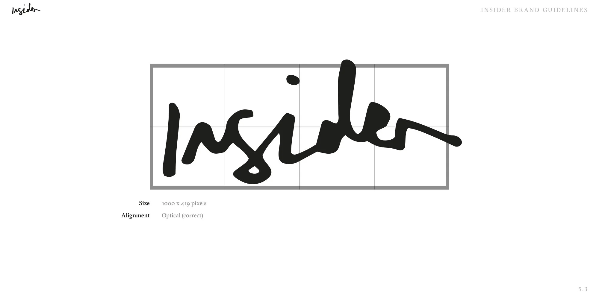
Created logo, based on my own handwriting
Communicated using HTML and CSS terminology alongside developers to ensure they understood requirements for the designs during the building phase
Designed look and feel of social content and trained and supervised social media team in the execution of it
Directed video team’s creation of Insider content, creating animated prototypes to communicate clearly in terms of timing, speed and typographic hierarchy
During the first 18 months, traffic rose to 6 million page views and 2.5 million unique users a month. During 2020, stats also showed that Insider was the 3rd highest performing section for page views behind news and sport.
Branding
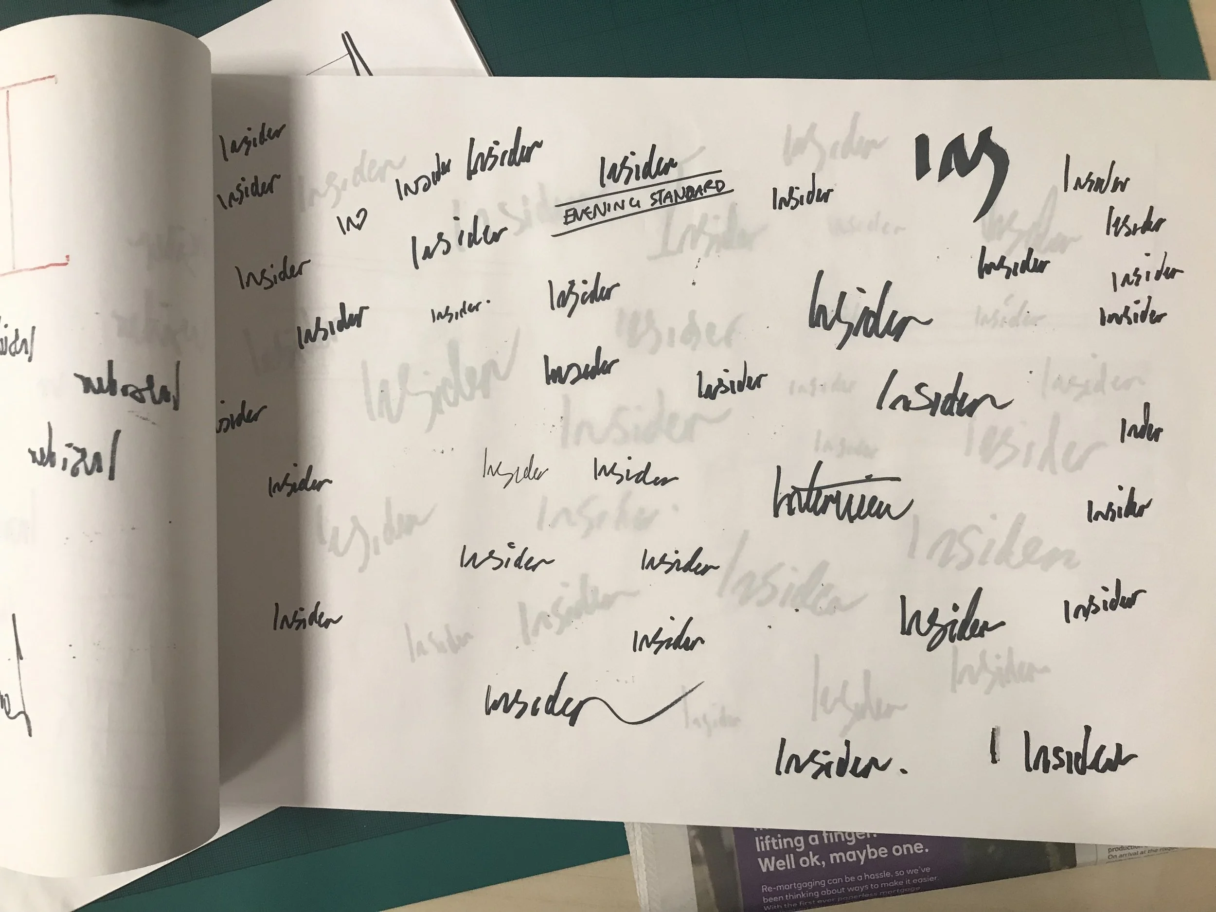
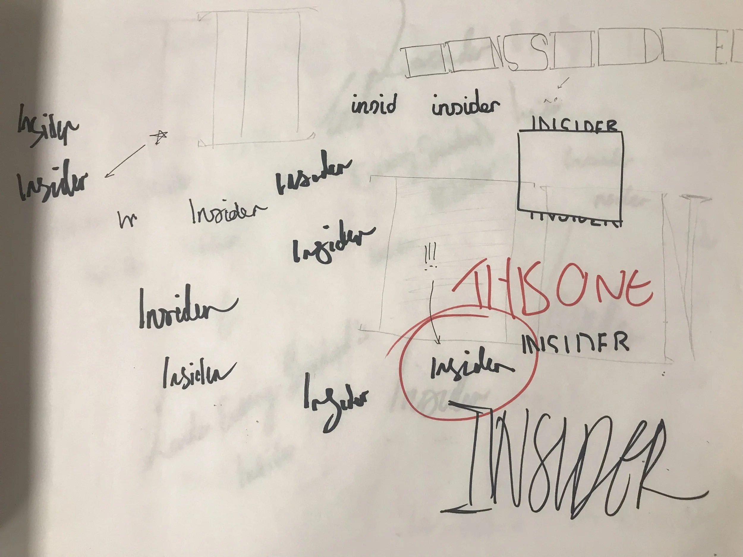
Insider was pitched as a “love letter to the world of luxury lifestyle”. After quite a few experiments, stakeholders and I settled on a handwritten logo – something of a depart from the very constructed, formal world that many associated publishing with.
After writing it out some 100+ times, using different techniques and mediums – something I’m sure Jack Torrence would be very proud of – I landed on a variant that I liked. After digitising it and making a few small tweaks, Insider’s new logo was ready.
Typography
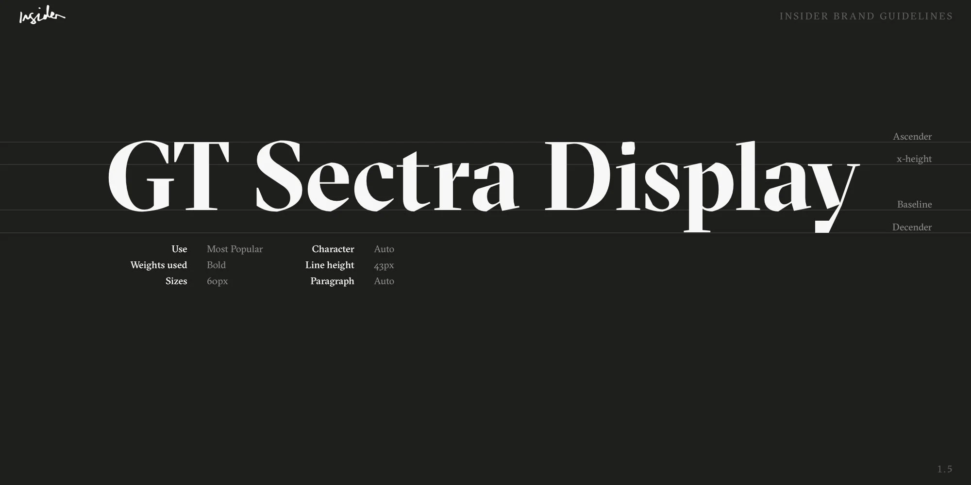
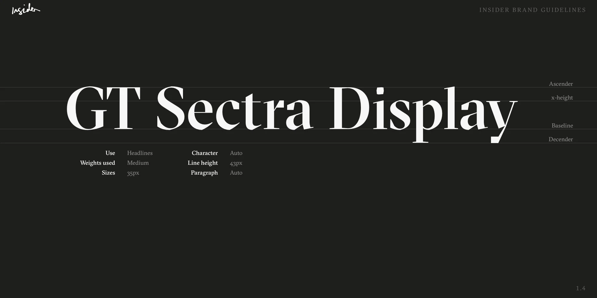
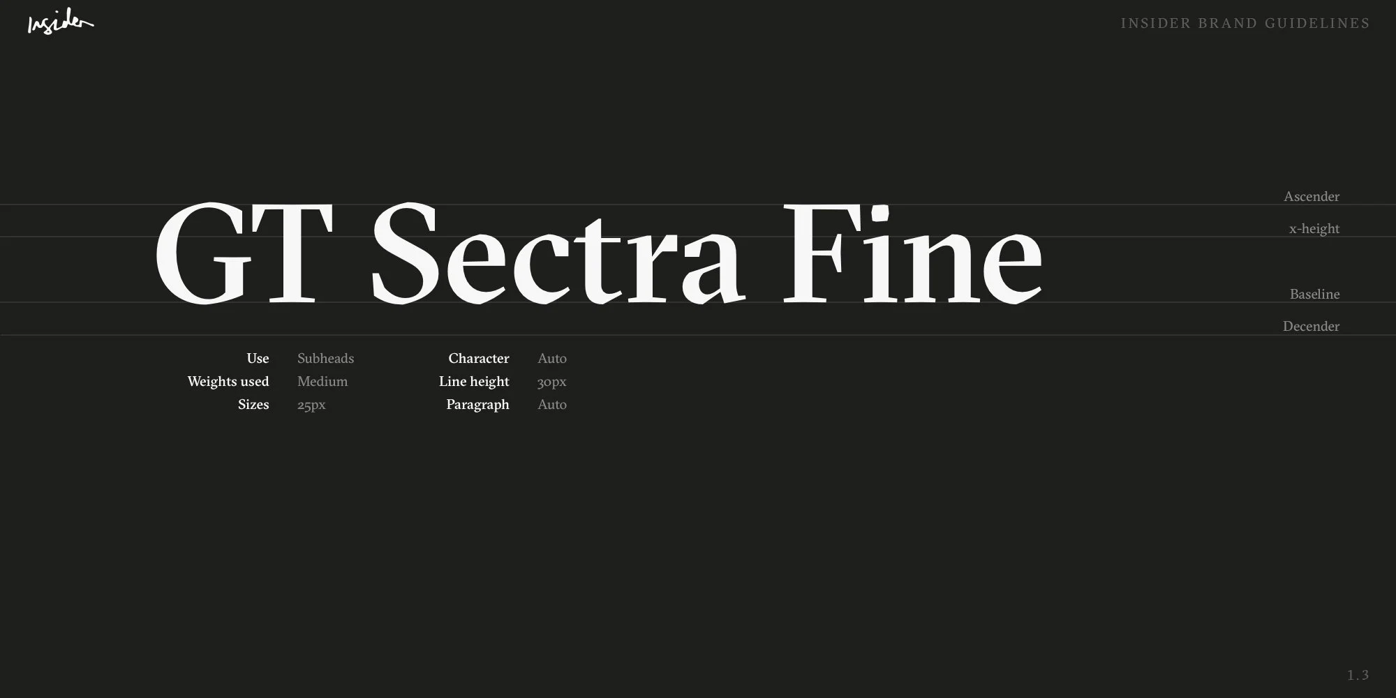
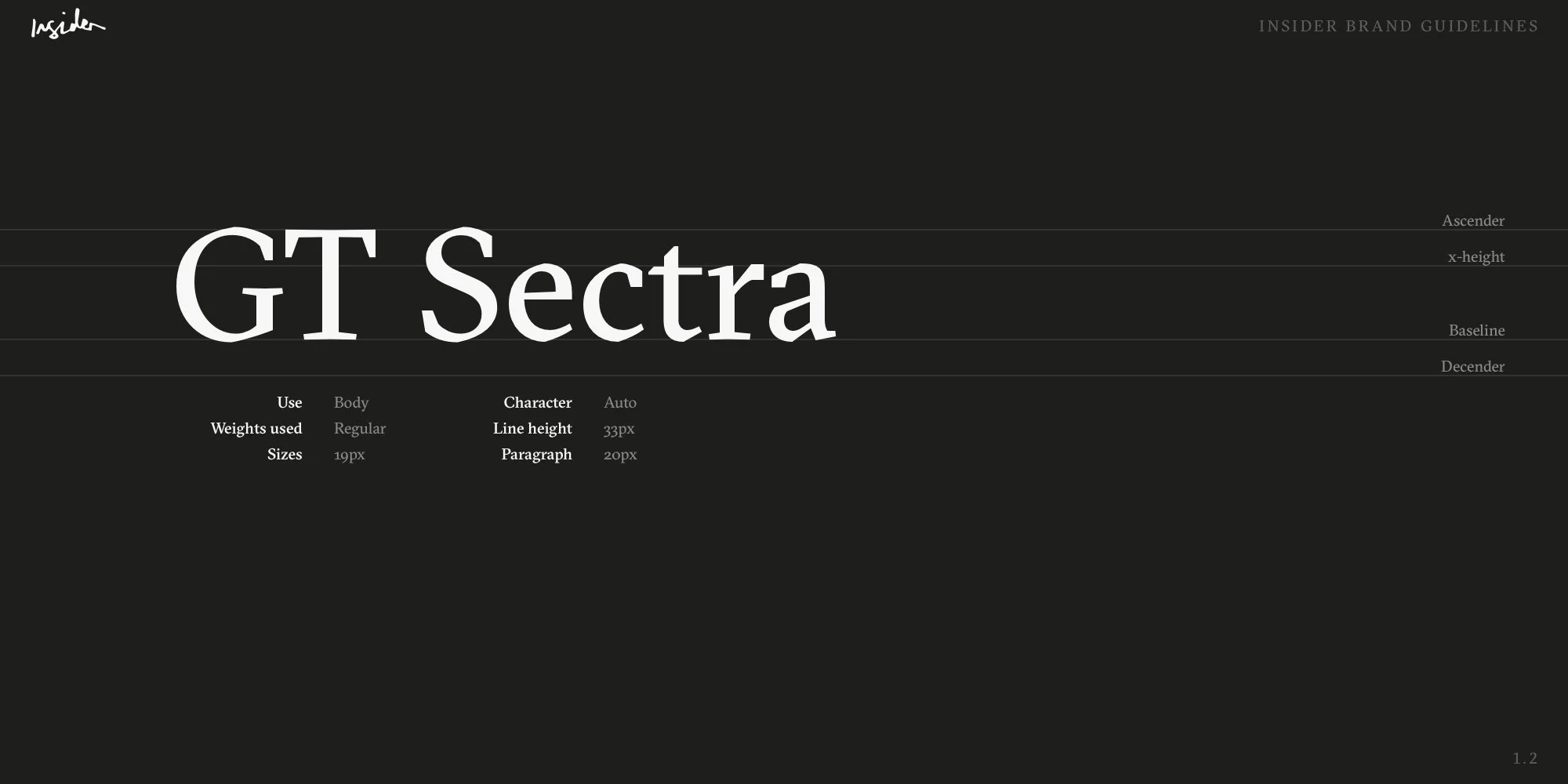
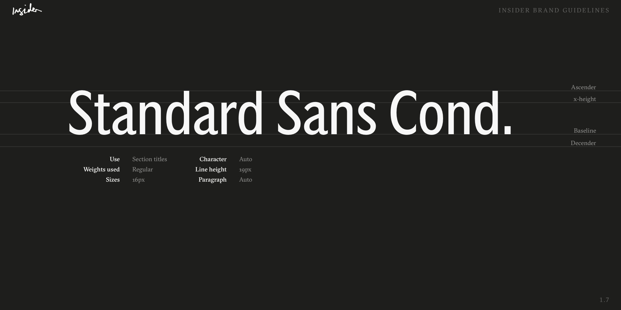
Stakeholders were keen to strike out with a new identity entirely separate from the Evening Standard label in order to capture a luxury lifestyle audience. The Standard had its own typefaces (Standard Serif, Sans and Condensed) but they wanted a new masthead face.
I ran workshops with stakeholders and the future editor of Insider in order to create a set of keywords and feelings that I could use as building blocks when choosing a typeface. After a few sessions, we came back with a celebratory, organic yet ornamental feel. Insider was meant to document the natural beauty of the luxury industry whilst retaining the sharp, meticulous and concise nature of the journalism represented within it.
After lots of searching, I settled on the GT Sectra typeface, created by Swiss type foundry GrilliType.
This typeface has a great story behind it as it was created by hand, off-screen using a fountain pen. It was then cut down using a scalpel and then digitised to give the typeface its distinctive look — cor, lovely!
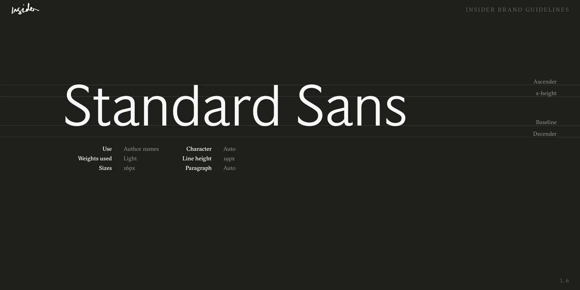
We stuck with Standard Sans for our accent face as that allowed us to keep some Evening Standard feel about it when using settings / metadata so that our users still felt like they were within the Evening Standard ecosystem.
Colour
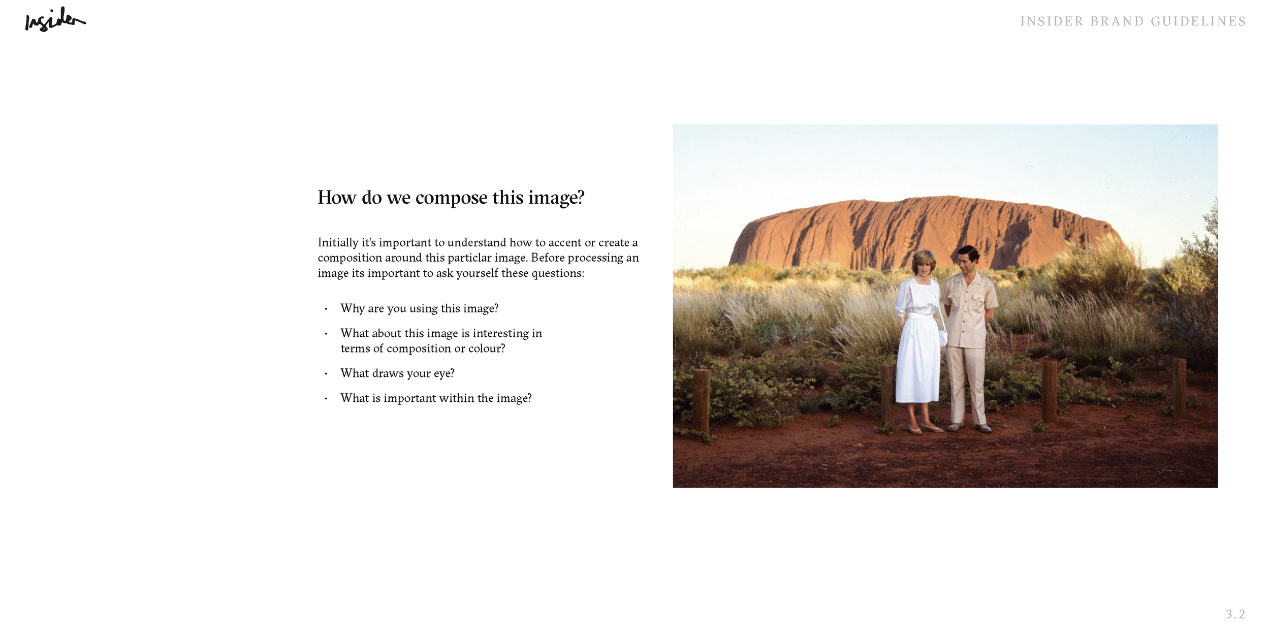
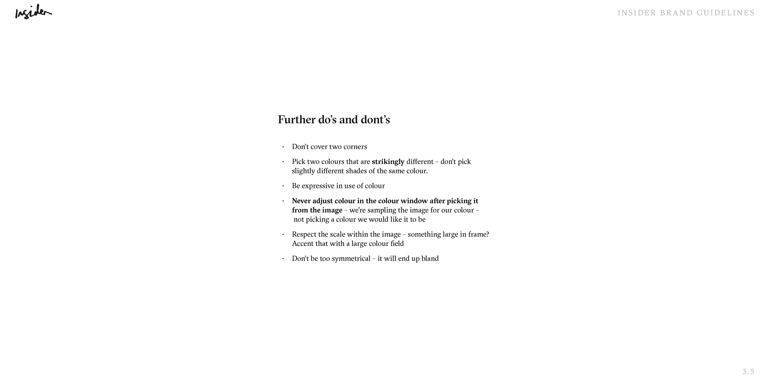
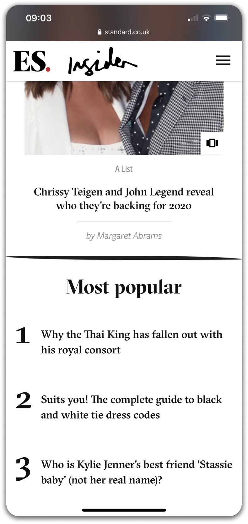
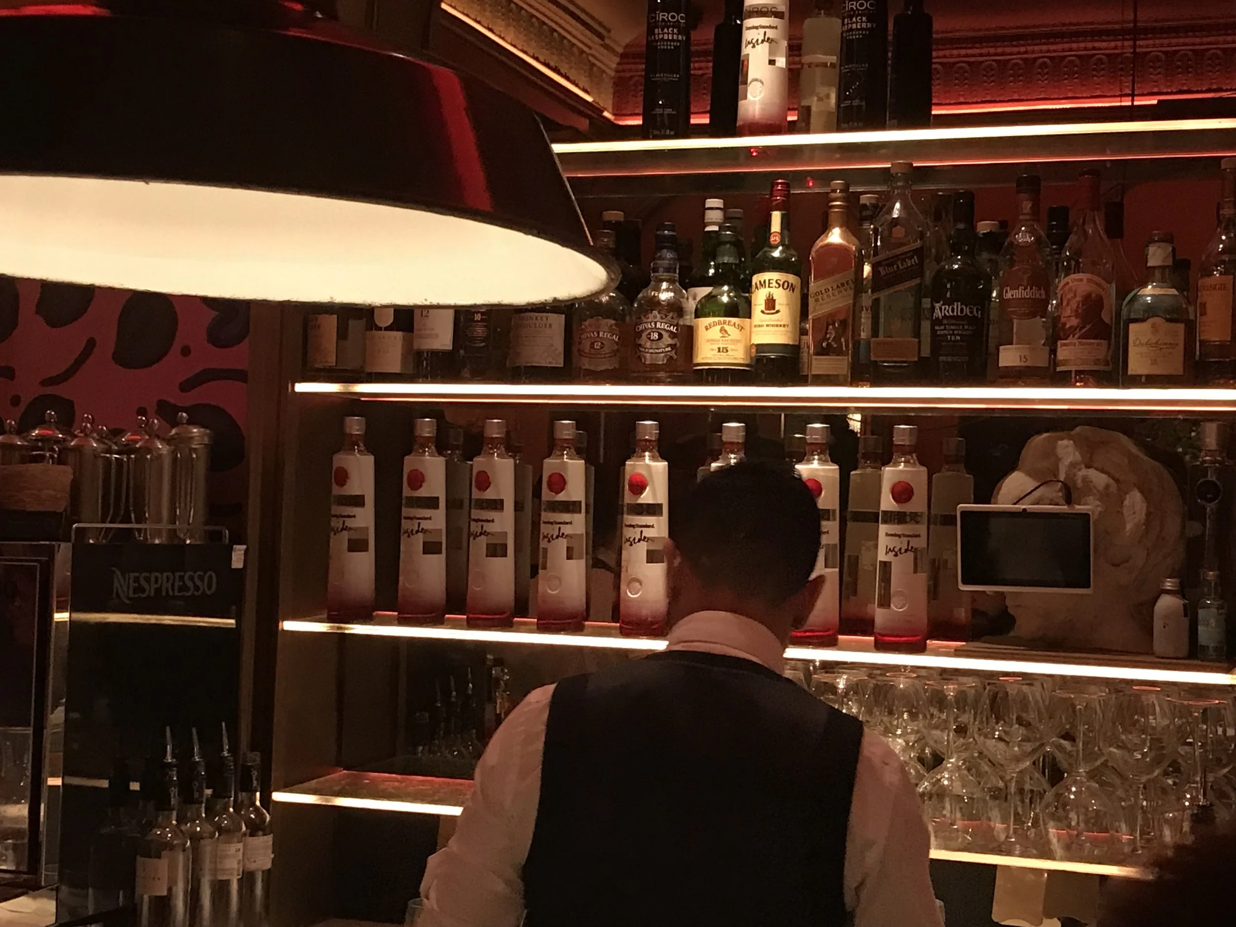
Adding colour to the Insider brand was very tricky at face value. We didn’t want to create a potentially restrictive brand palette that could clash with the beautiful imagery on the platform. Insider was, from the get-go, marketed as an image-first, Instagram-esque news site that championed the visual medium over traditional text. It was content that led the colour, not the other way round.
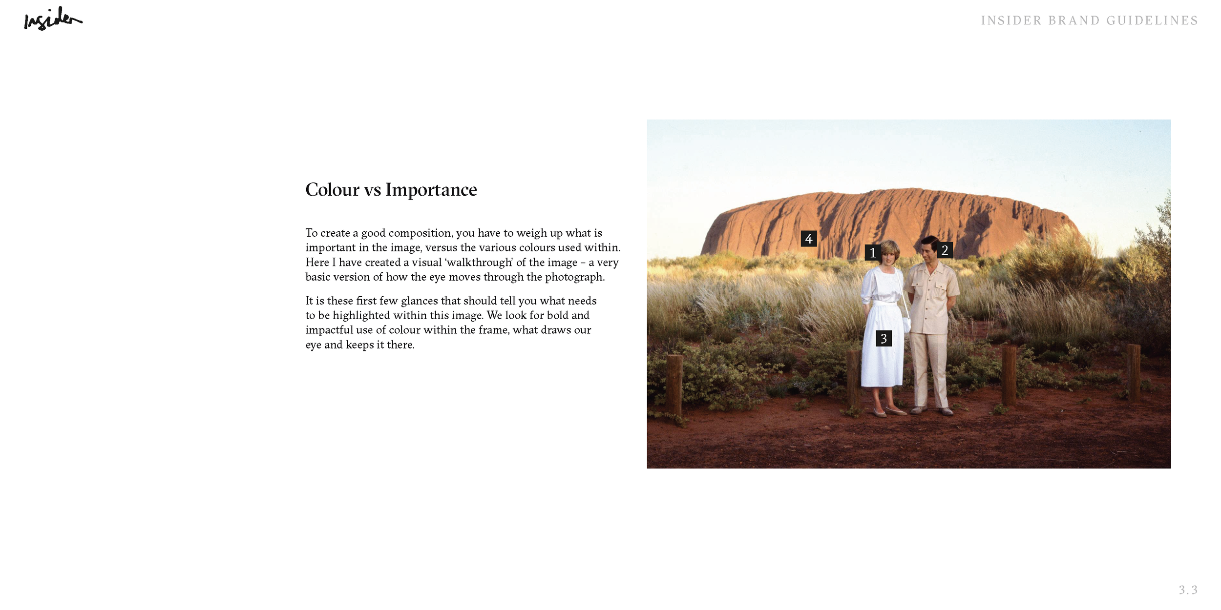
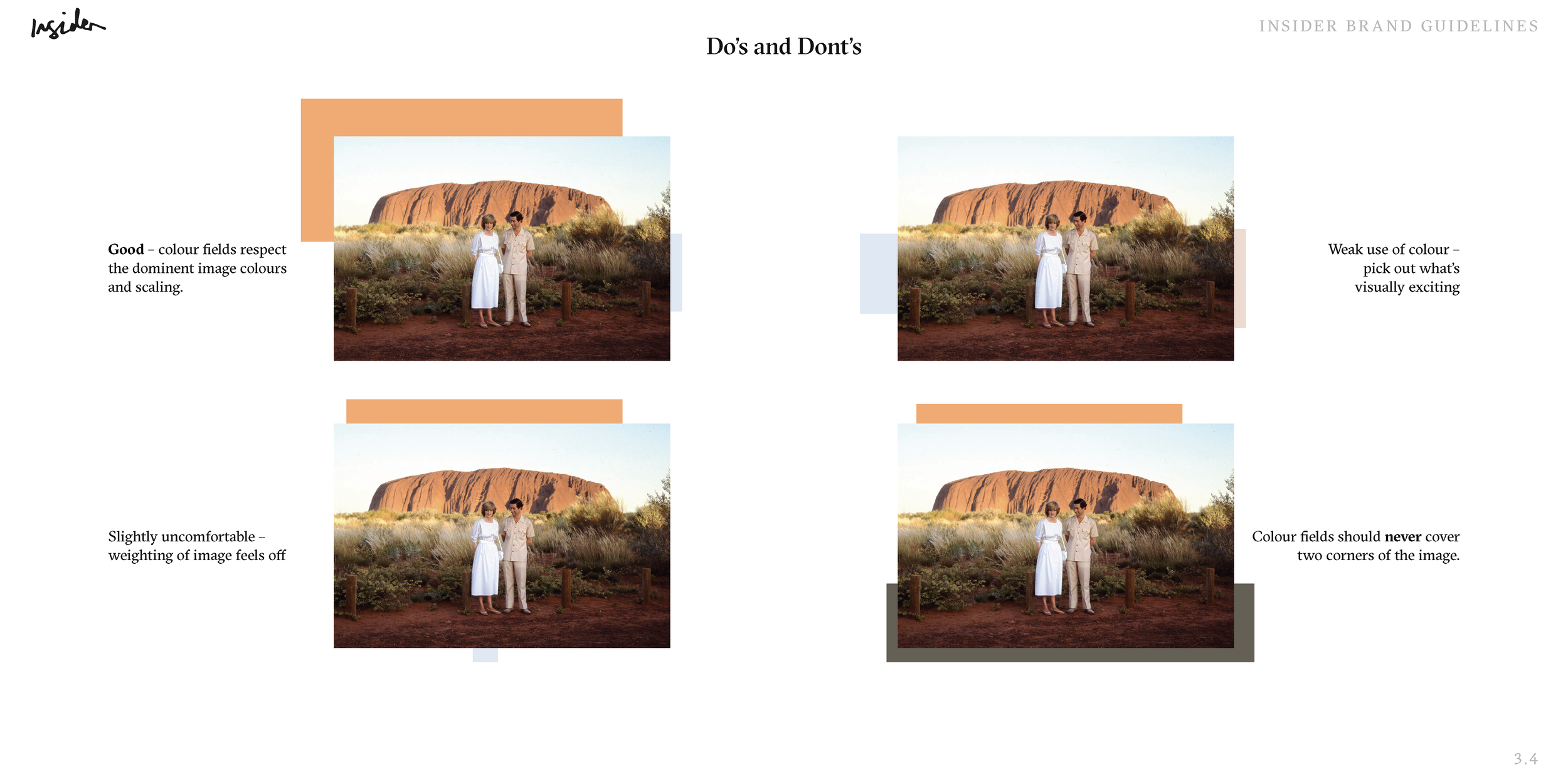
It therefore worked really well to develop a varying colour field technique to add flourish, accentuate particular aspects of an image or simply present them in a more pleasing way. The images then became little pieces of Insider ‘artwork’ – easily recognisable as something inherently from Insider whilst also retaining the core image. Taking inspiration from artists such as Mondrian, Kandinsky, Turrell and Newman, this colour field technique was put into practice.
These colour fields can be deceptively simple to create so it's important to think of them more as compositions or that you yourself are creating an image vs accenting another. See below for some examples of how to handle a particular image and the do's and don'ts of creating Insider imagery.
Social
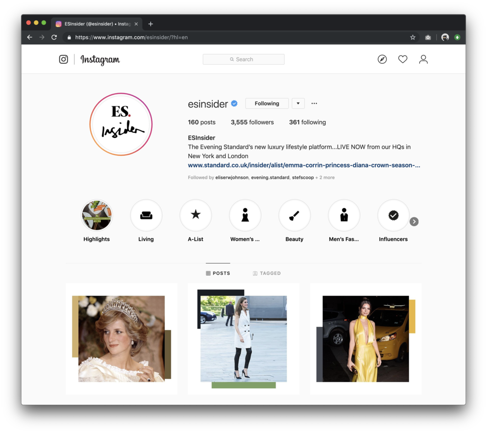
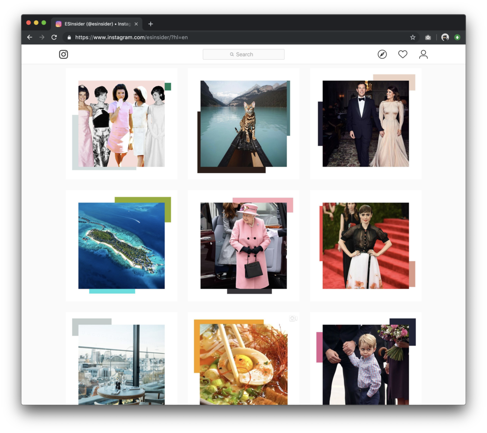
I was keen to have Insider social posts different from regular instagram posts where we just post an image – I wanted Insider to be instantly recognisable at a feed level without having to check the username.
Using the colour field image processing technique I had developed earlier in the project, I created a Photoshop template for our social team and taught them how to use it and how to build Insider-style images. This was successfully rolled out on Instagram and helped achieve critical mass on social.

Videography
I also developed a set of video furniture for our video team to use for Insider. We needed titles, tags, interview names and description text so using Adobe After Effects I created a simple set of moving titles for our teams to create as templates for their editing suite.
Titles
Tags and interview info
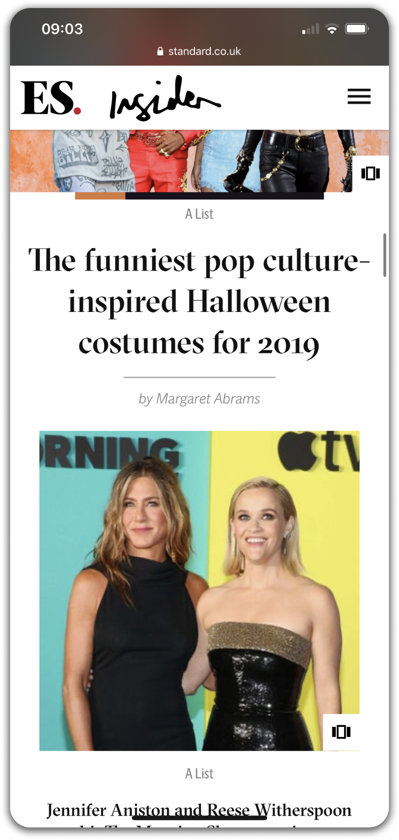
Website design
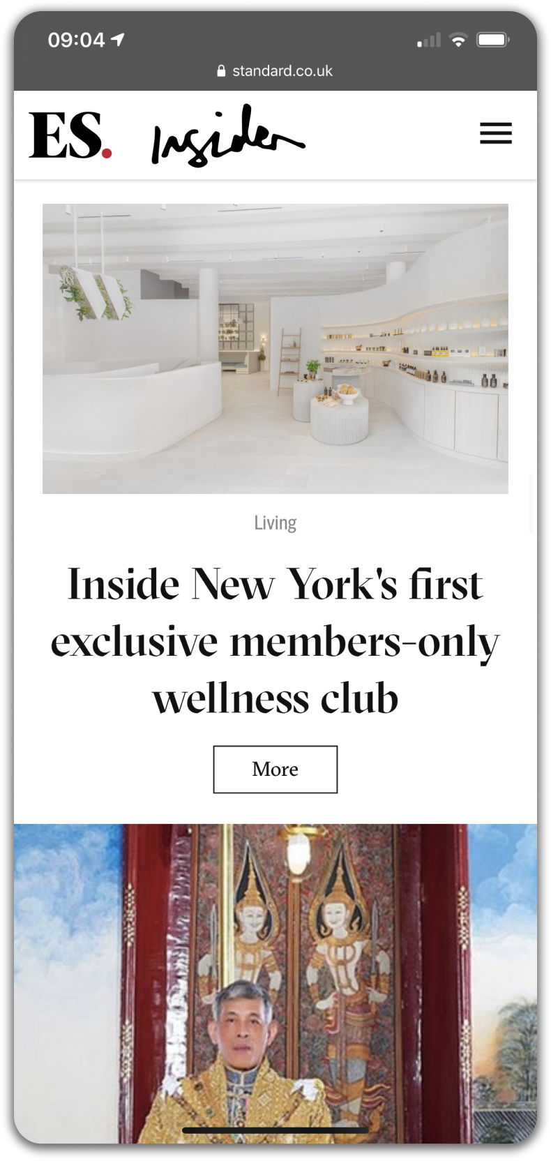
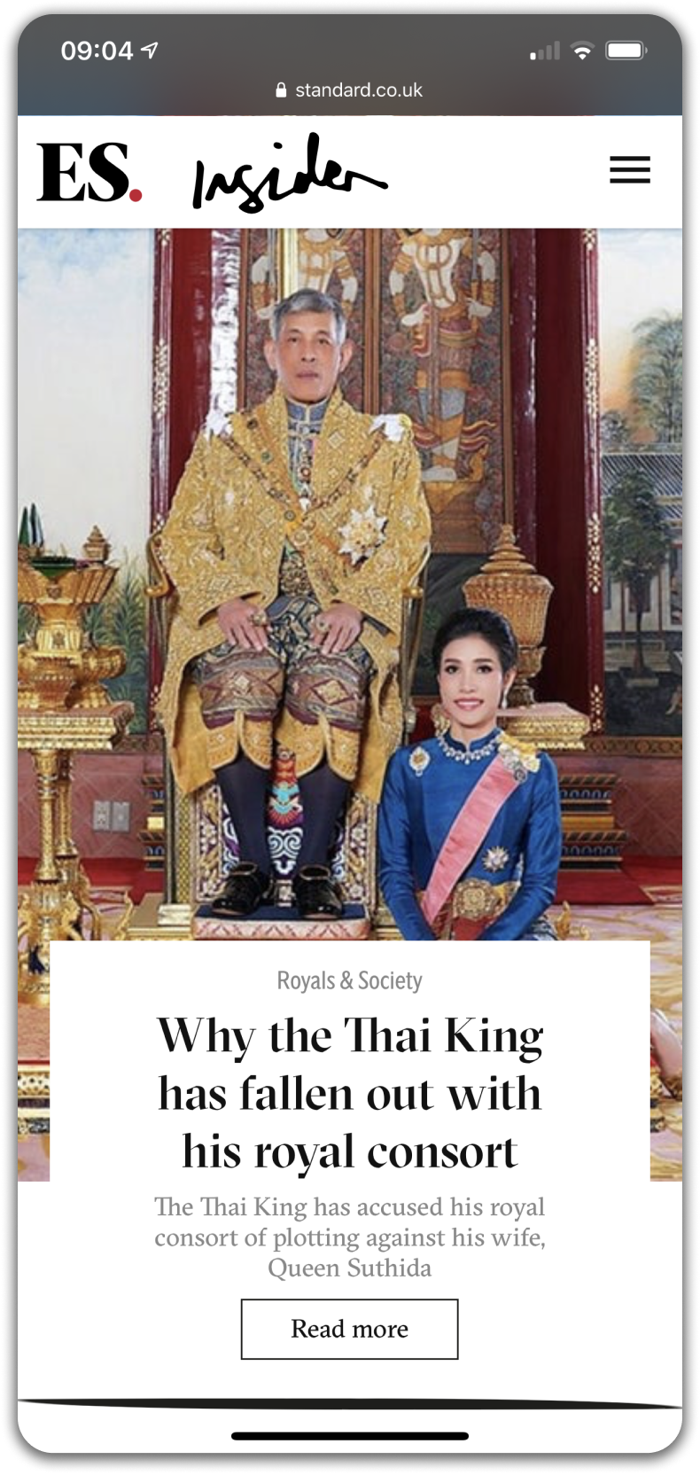
We were keen to lead mobile first as preliminary research showed that Insider’s target audience were younger than that of our main Evening Standard audience, and consumed news content primarily through mobile devices. Keen to adhere to this we designed Insider’s website mobile first, bringing through the colour field technique we developed as accents below images on section pages.


🧙♂️ The cool stuff that did (and didn’t) happen 🧙♂️
Cool thing 1
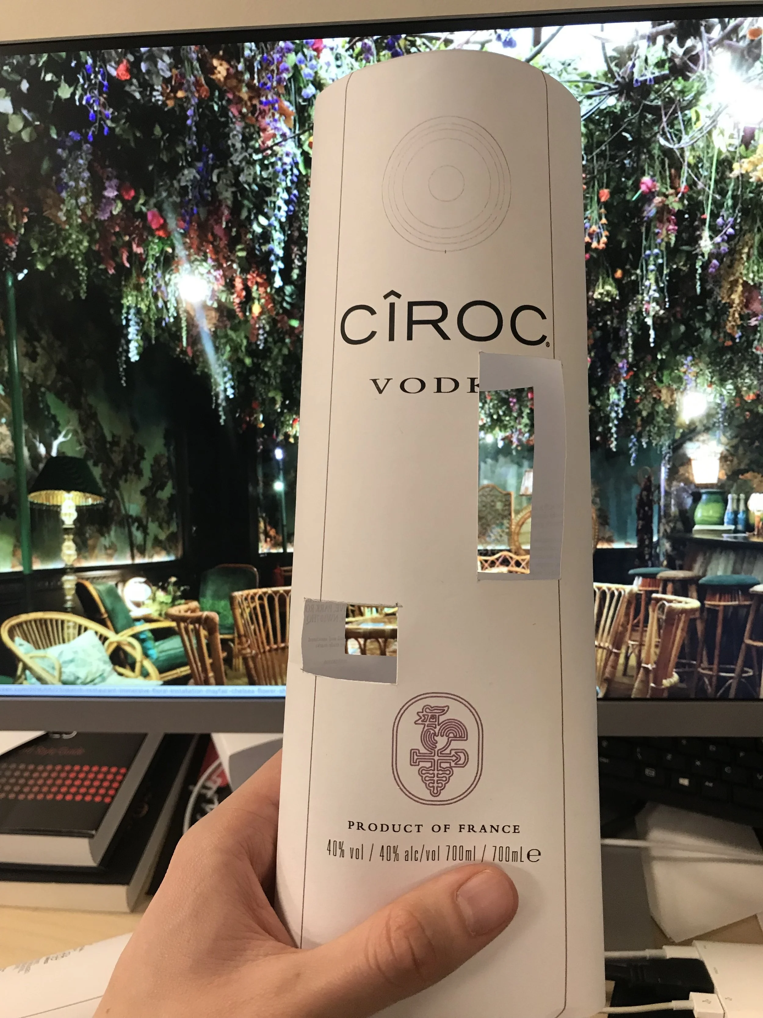
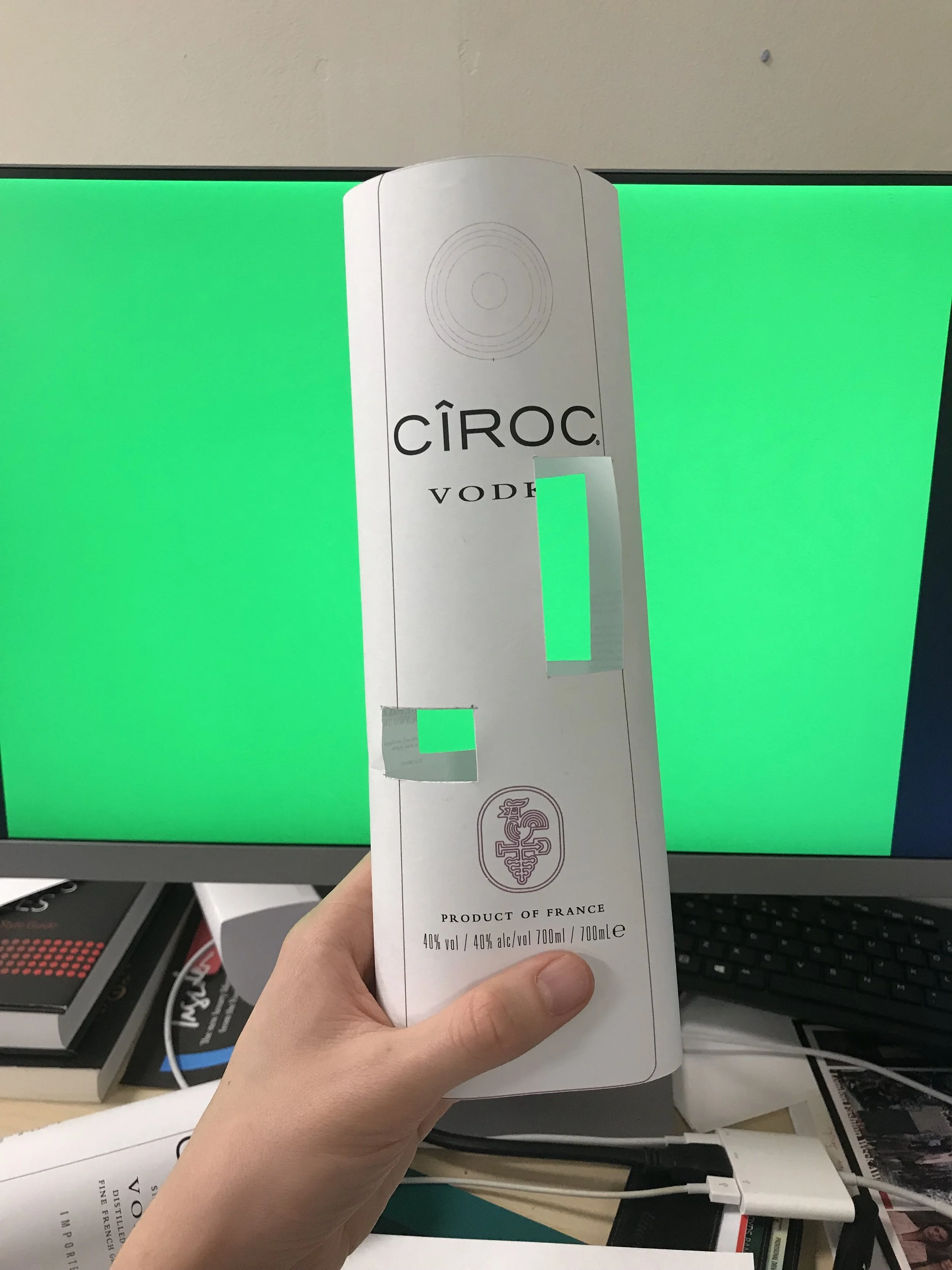
Ciroc collaboration – DID happen
I was asked to design a custom bottle of Ciroc vodka that we built for our launch party. This was given to various influencer guests and used to create a custom cocktail. Taking the image processing technique I had developed with earlier imagery on the platform, I applied it to the bottle of vodka, creating windows for the colours and imagery behind the bottle to shine through.
Cool thing 2
The Living Wall – DID happen
We wanted to create something that reflected the qualities of the venue we were hosting the launch party in. sketch is famous for its visuals, being a highly photographed location, it was exactly the right place to kick Insider off. To accent the room we were in, we commissioned a high flower wall with Insider written in grass across it.
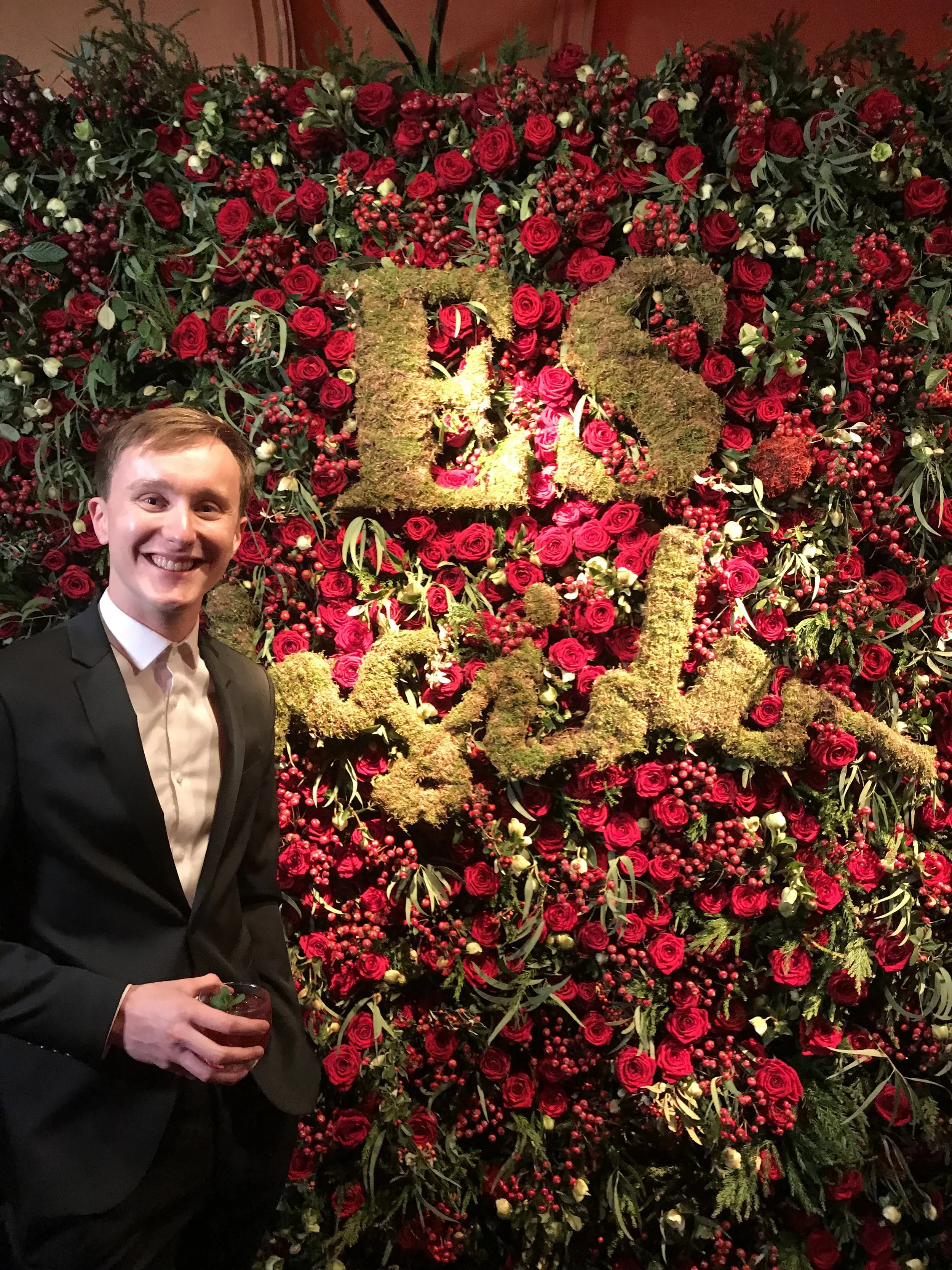
You’d be grinning like this if your handwriting was 5ft wide and set in grass…
Cool thing 3
The Evening Standard Christmas bauble – DID happen
In order to celebrate the launch of Evening Standard Insider, we had two large Christmas baubles made up to be mounted on the large christmas tree in Covent Garden, in the centre of London. See the video here 👉
Cool thing 4
Interactive Insider imagery – nearly happened
A super cool idea! Working with a friend, we created a way to detect the average colour from within an area of a camera feed.
Our plan? Sample these colour averages automatically, and project those colours behind the people in the photograph so they become a piece of Insider artwork.
We had planned to set this up at the venue but unfortunately we didn’t end up having the space we needed to set it up properly, and stakeholders were keen not to overwhelm the venue as it was already a very visually attractive space. I would have loved to revisit it at some point as the tech behind it was super interesting.
To improve I think we needed to set up colours into 256 separate options and sample the live feed to pick out the mode of the colours shown, not the mean so we avoid any muddy browns being taken as a mean.
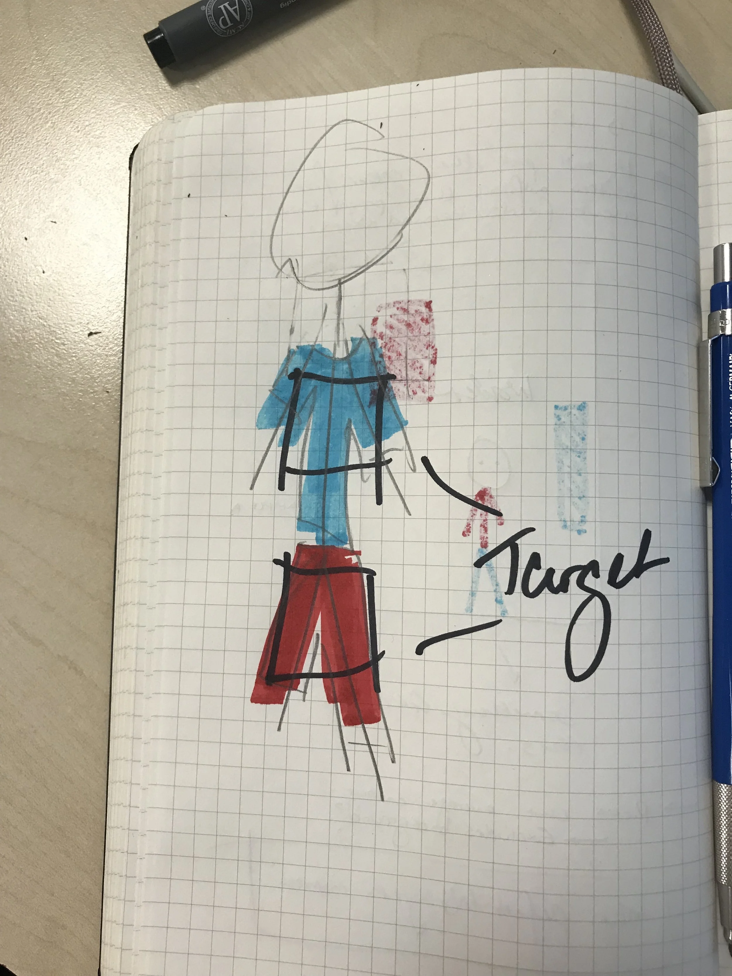
Sample the areas of the guest's outfit
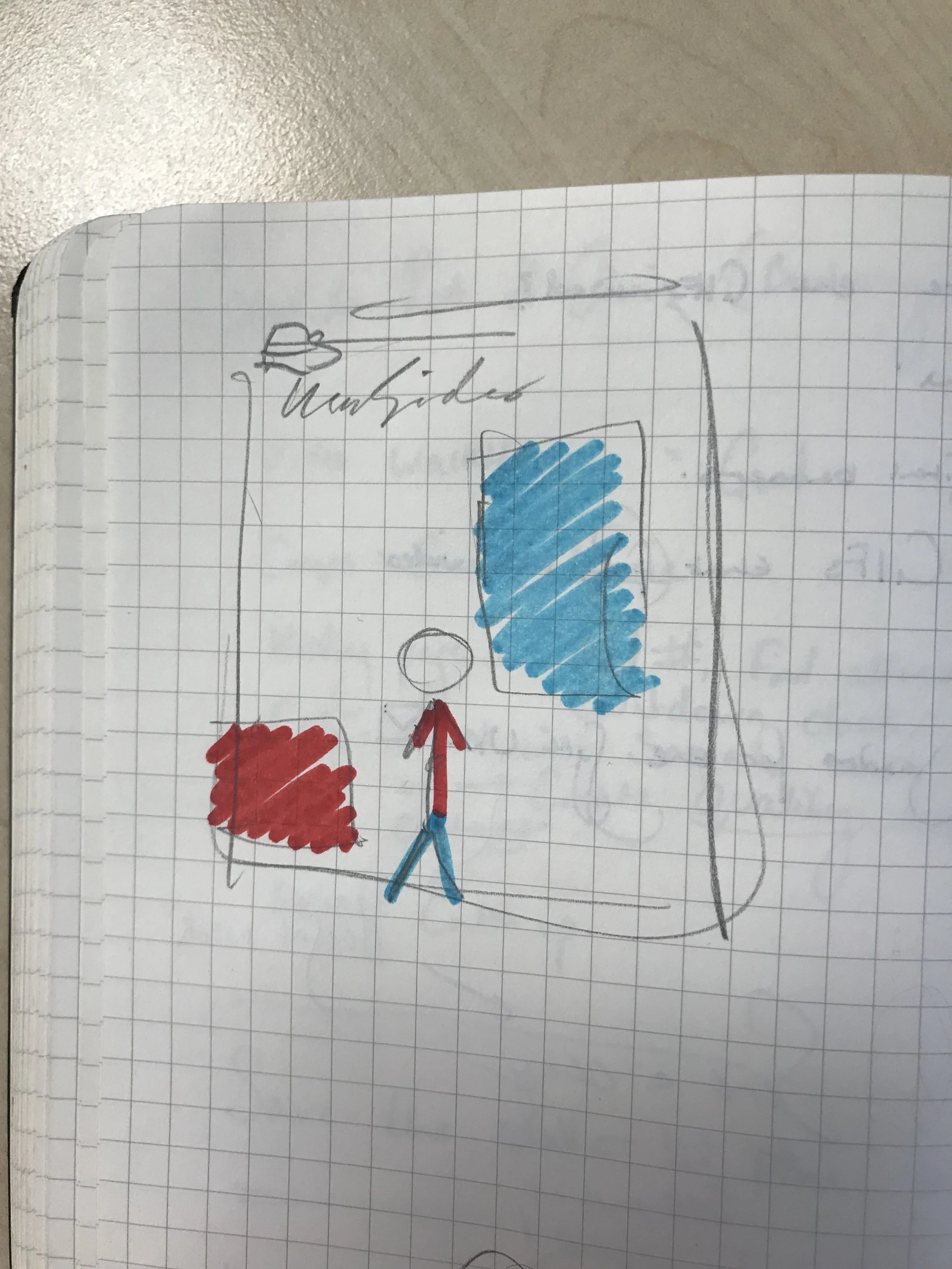
Project those sampled colours behind the user with a hashtag ready for the guest themselves to become a piece of Insider social content
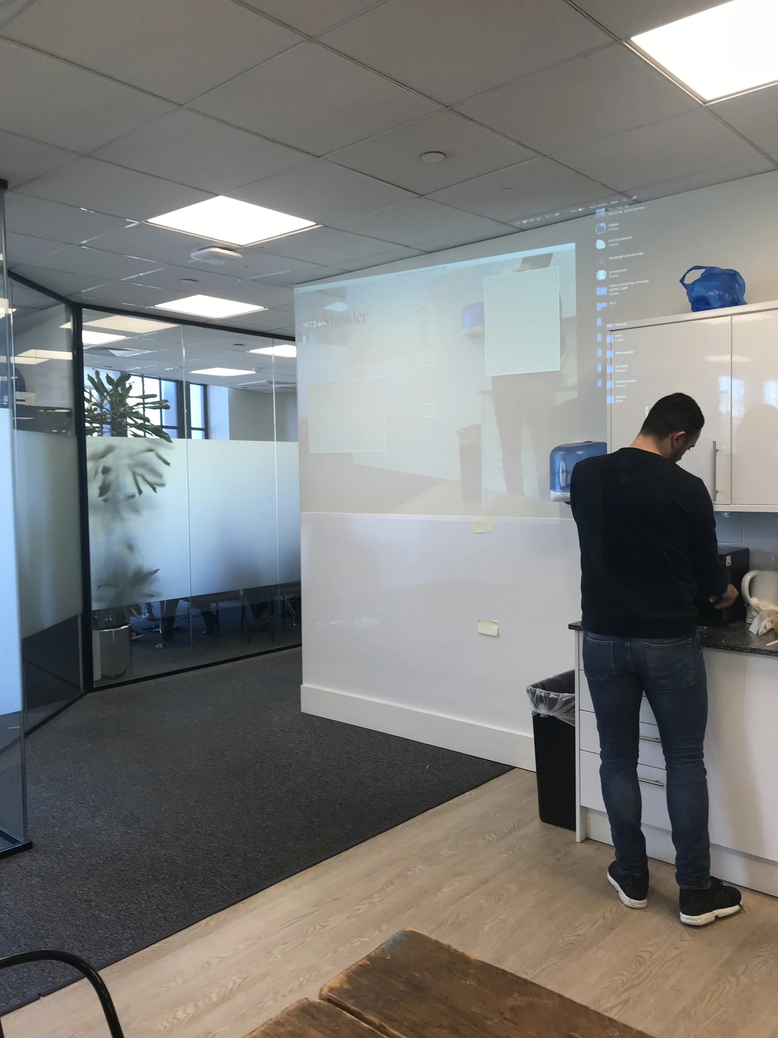
Our super lo-fi test setup