Breaking news as it happens, not after
Independent Premium rebrand
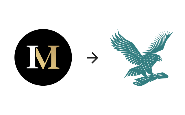
In August of 2019, my team at the Independent was given the task of rebranding the paid-for content away from Independent Minds to Independent Premium.
Whilst Independent Minds was a great play on words, it didn’t truly communicate the premium content that we were writing. Initially we went through a few different options – Independent RED, Independent Plus etc, but none of them clearly communicated the ‘premium’ offering, which was the main concern raised by stakeholders going into this project.
We were given a single hex code that senior management liked and briefed in to create a brand from this — very much a proverbial “good luck” and a pat on the back.
We were given a two week deadline to completely strip the site of any Independent Minds branding (over 250 touchpoints), as well as creating an Independent Premium brand including logo, brand language, design assets and required design libraries and making sure that it fit the parent brand more effectively than Independent Minds.

Given the nature of the extremely short deadline for such a task, we worked very closely with our development team directly, helping go through the code with them, making the switch from old to new as quick and effective as possible.
We introduced a wider colour palette alongside our premium-base in order to give our design system a sense of depth and layering, allowing us to create height and tactility in pages. This use of colour was used on the site through Premium-styled buttons, icons and other UI elements.
After working the colours up to give us more usable options, I set about creating Sketch libraries for our team to use as a resource in order to design for Premium quickly and consistently. After discussions with our UX designer, we based these libraries on the atomic model.
Starting out, I brought our designed logo into the library – a reskinned icon-only version of our current version – sans circle and in the new Premium colour.
Next, I brought in our colour palette, created them as replicable layer styles for Premium so they could be rolled out across components, then defined our text styles. From this, I started to build UI components such as buttons, hairlines, image wrappers, topic capsules and overlays converting to symbols as I went.
There was certainly not enough time to build a truly functional design system surrounding Independent Premium, but given our two week deadline, we achieved a solid base.
After the initial atomic library was built, I sat down with the project manager handling the deadline for this project, as well as the UX designer and we defined what MVP was in terms of molecules and organisms in order to hand it over to the developers.
Selling page
Whilst we were creating this new look for Independent Premium, we had to keep the e-commerce frontage for the brand up to date. Keeping that in mind, we sat down with our marketing team and gathered requirements for the new Independent Premium selling page. Previously, the page had been very busy, dark, and the information passed onto us from the data team told us that a very small number of users made it the whole way down the page.
We were keen to simplify the page, making the user journey as short as possible and allowing for quick and easy sign ups. I worked closely with the UX designer on this, designing a simple 5-panel layout, each geared towards a different persona-focused encouragement to subscribe.
Independent Premium app
After rebranding Independent Premium, working together with a UX designer and a product manager, we created the brand new Independent Premium app.
Previously this had been a standalone and – at the time – relatively unsuccessful forray into creating a live news app.
Over the course of roughly two months we created a lean component suite, married up to components in our current CMS so editors could easily create layouts that worked both on web and app.
We started out by gathering data on the current app; what users liked/didn’t like about it, and prioritised this against any new features we wanted to add. One of our key metrics was to add a feed showcasing our new Premium content, driving subscriptions through increased visibilty of articles that previously had not had as much attention.
After the initial data gathering, we sketched out multiple screens, and from those built our MVP prototype in an eight hour design sprint using Sketch and InVision.
Premium feed
This page was created to showcase our premium content, front and centre. Given that we put out roughly seven pieces of premium content a day, we were able to make this page the one-stop shop for Premium users to get the best out of their subscription.
We organised the feed by:
Today’s highlights
Yesterday’s highlights
[day] [month]’s highlights
Every day we also offered a free sample at the top of the feed to allow non-subscribers to get a taste of the content that we put behind the paywall.
News feed
Seeing as this app was being changed from the Independent Live app, we didn’t want to change too much when it came to features that existing users already used.
Previously, the Independent Live app had been an alternative (and ad-free) way of reading articles and our non-paywall content, but with the introduction of Premium, the pre-paywall content had to take a back seat to our paid-for content, whilst still being readily accessible.
We moved the content to our second page – titled News – and tried to make it feel a little more like our web experience, with a few tweaks here and there to make it more appropriate for an app format.
I worked closely with a UX designer on creating components for both static and responsive component options, but after some testing, we made the switch to static as it would not be adversely affected by Premium content being pulled through into non-Premium feeds.
We knew we had to reduce the amount of content hosted on our app to keep size down, so we reduced the number of in-app feeds down to:
News
World
Voices
Sport
Culture
Lifestyle
Extras
Two of the new features we wanted to introduce to the app were a) the ability to read the back catalogue of ebooks and b) book tickets to our Independent Premium events.
After some user testing in which we gave users groups of features (premium content, puzzles, bookmarks, ebooks etc) and asked them to sort these into different areas that they would expect to find them, we decided to give these two new features – as well as puzzles – their own section under the title Extras.
This meant that features that would perhaps not see as much activity as the rest of the app would not use up real estate in higher traffic areas of the app, and were in a tabulated layout that could be easily navigated once on the Extras page.
Clicking the main Find out more CTA takes you directly to the Eventbrite page allowing a smooth and short user journey for those interested in booking events.