Esports; from the ground up
Battlefy is the esports tournament platform of choice for the world’s top publishers, gaming communities, creators, brands with over a million hours of gameplay every single week.
Arcade Design System
December 2022
Starting at Battlefy it became clear that a single source of truth was sorely needed when it came to design and developer assets.
Our goal was to create a system which cut developer and design involvement (the most expensive part of any project) by over 50%, in order to speed up delivery for clients such as Riot, Apex Legends, Zotac, NHL and MLB.
Over the course of my time at Battlefy I 0-1’d an entire design system ready for launch and use across our B2B2C teams using Figma, Token Studio and Storybook.
—
Note: I have abridged a lot of this content but written out a longform writeup on how Arcade actually worked can be found here. Detail-lovers, delve in.
To start with, I created and ran several workshops with senior stakeholders including our CTO and Director of Design with the purpose of understanding what would be needed from a design system at Battlefy.
It quickly became clear that the design system would need to be massively functional across both our platform team as well as our “workhorse” ESO team* to be able to capture complex brand requirements from partnerships and output comprehensive, cohesive and quality Portals†.
—
*The ESO team at Battlefy is responsible for our main B2B2C output. ESO works with brands to create tailored experiences for gamers, which at the time of writing mainly involves the creation of branded Portals† and branded tournaments that are created with the external brand’s guidelines.
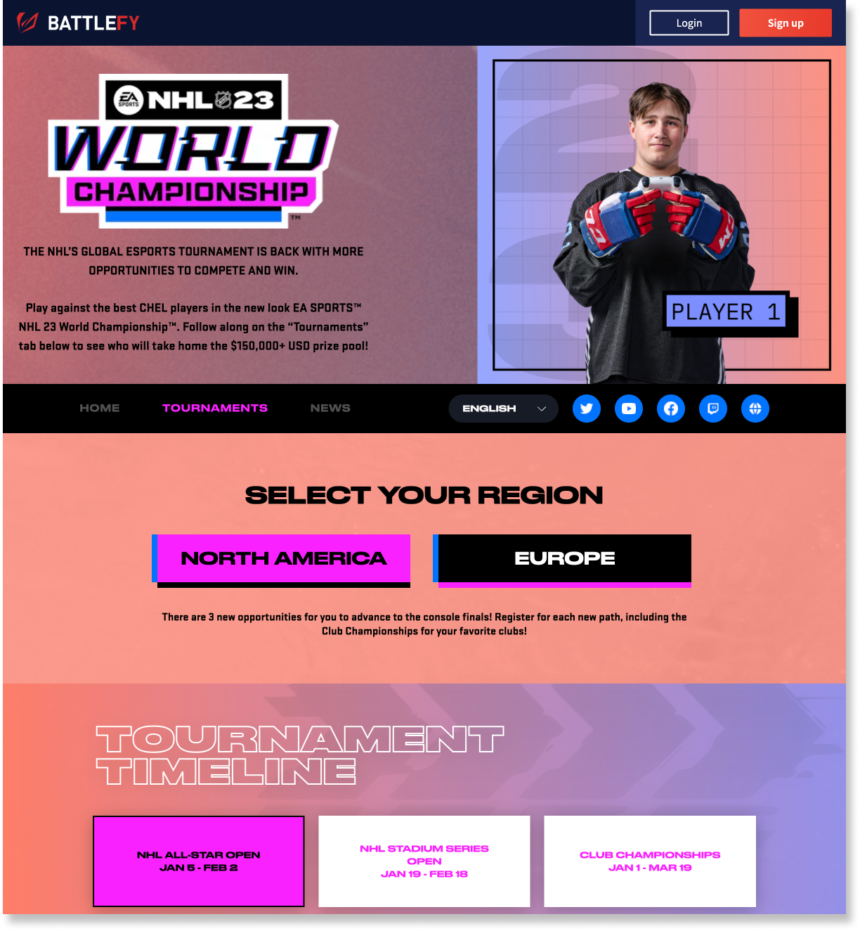
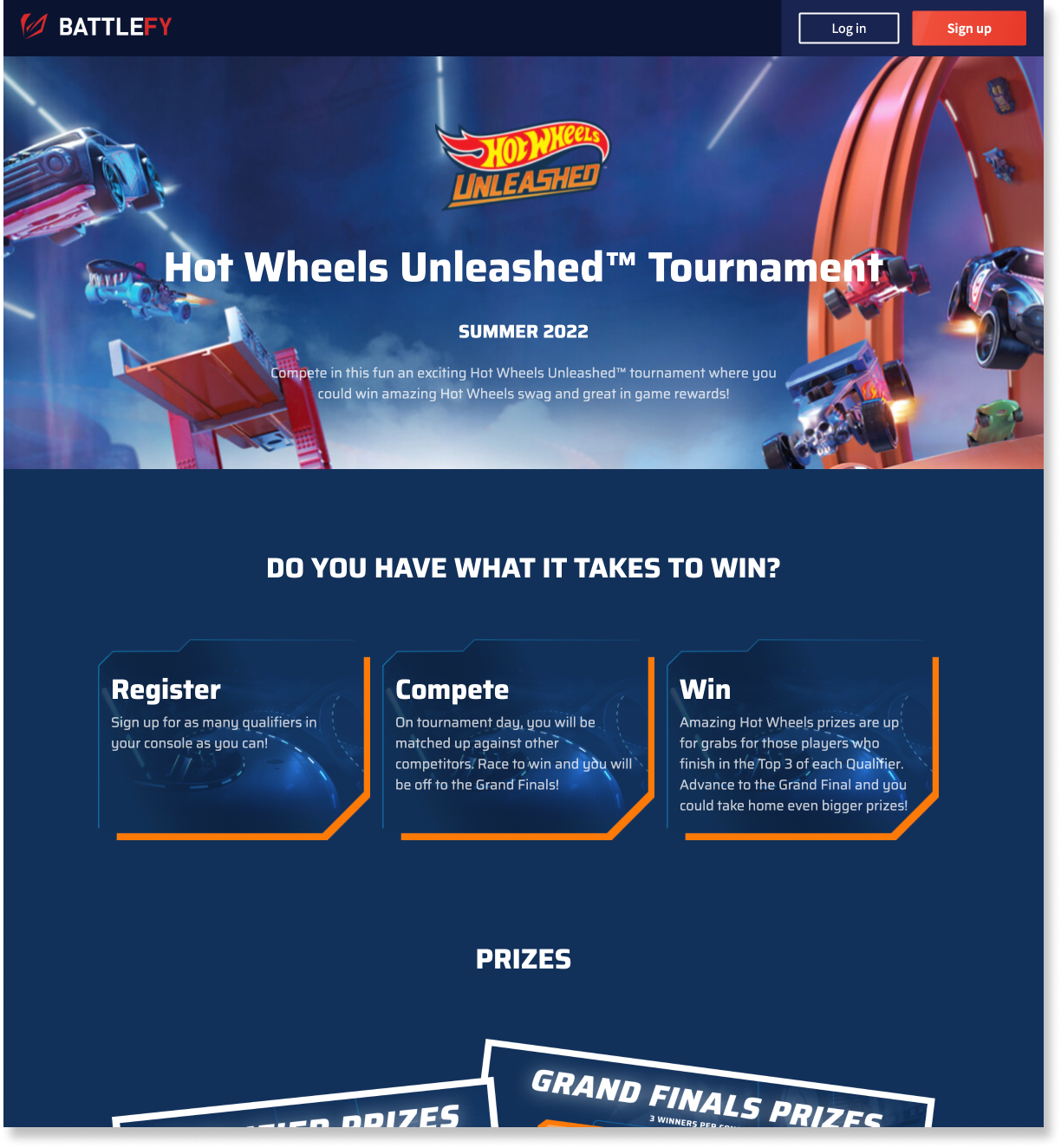
†Portals are external pages created entirely in the style of the brand that Battlefy is working with in order to advertise a tournament or promote a particular event that Battlefy are involved with. Examples are here and here.
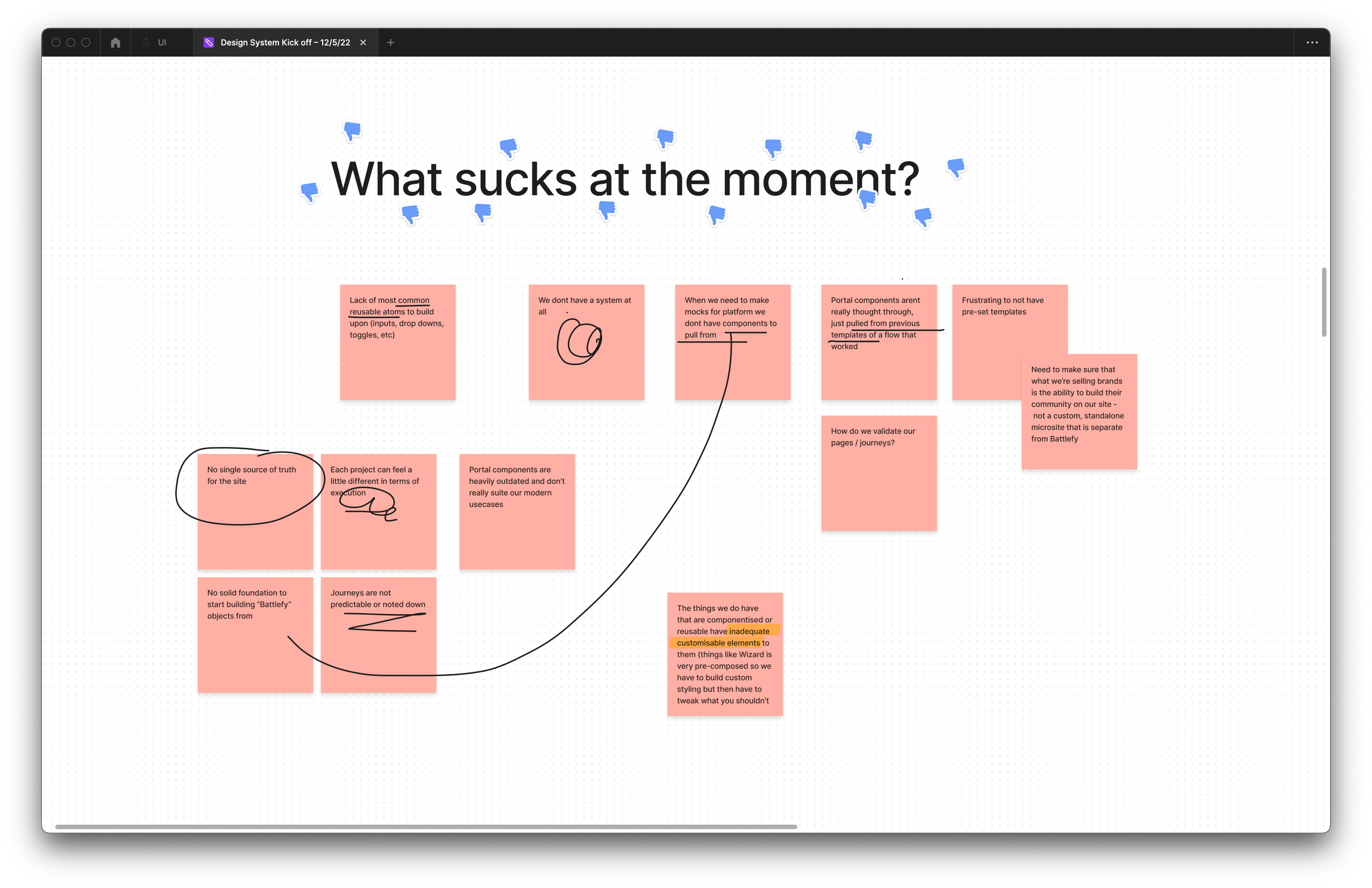
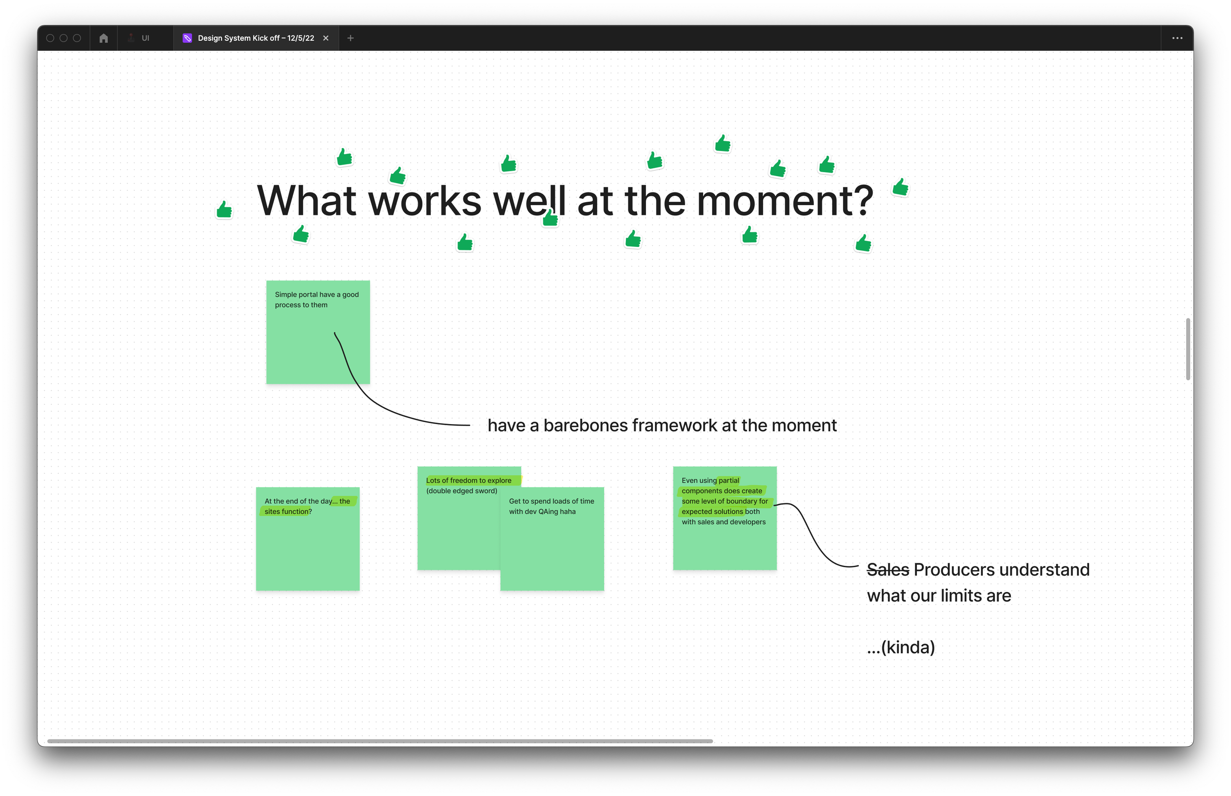
These meetings were the start of the brand new Battlefy Design System…
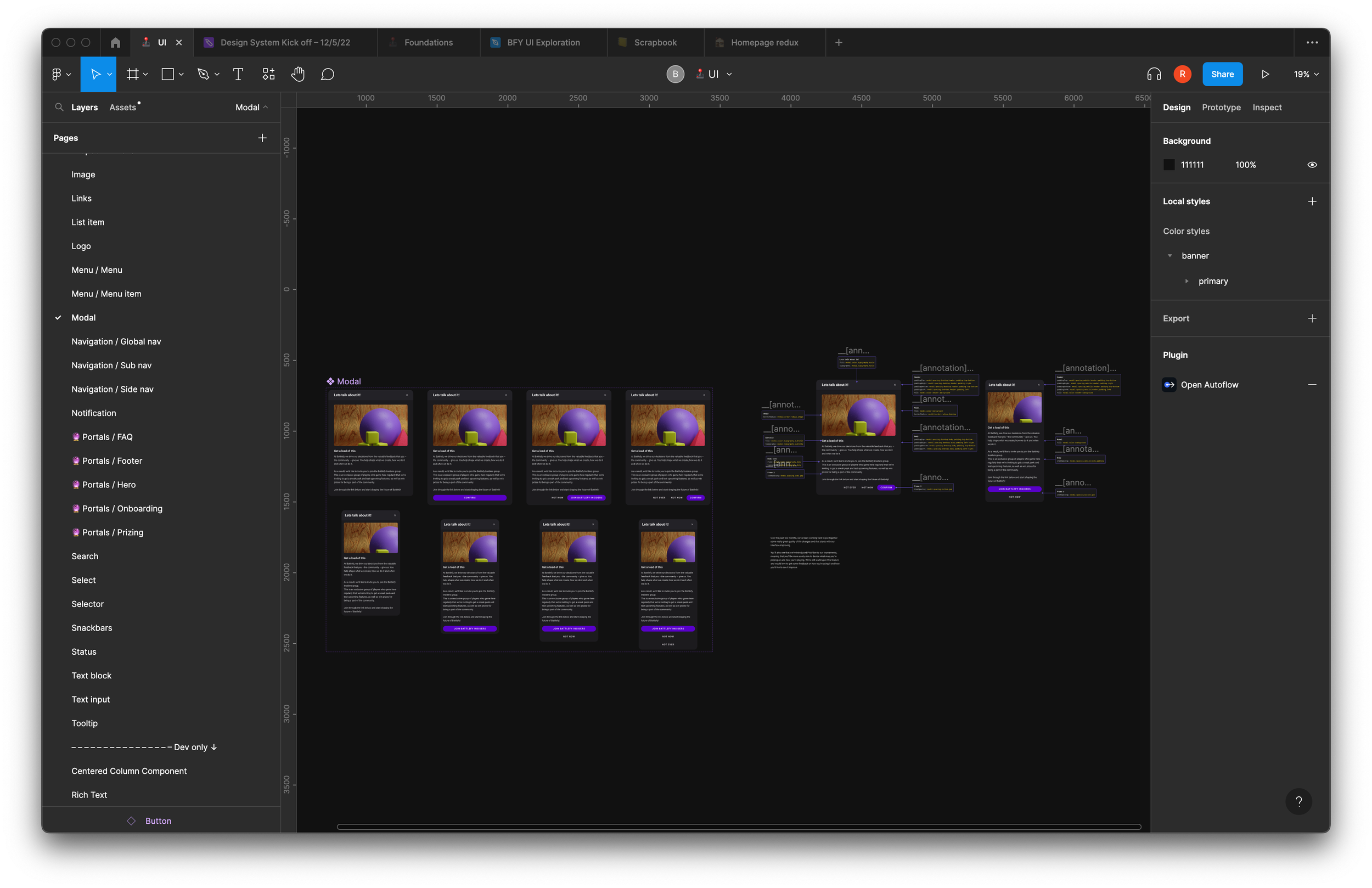
The ability to quickly create and standardise our Portal experience through Arcade was key to developing a solid foundation to the design system – and to ensuring its longevity at Battlefy. By focusing on the components required to put a Portal together first, we ensured that we not only hit our ambitious target (50% reduction in design/dev cost per project) but also that our components covered a large scope of usage.
Our Portals followed a typical layout:
Global nav
Hero
Subnav
Onboarding
Prizing
Tournament cards
FAQ
Footer
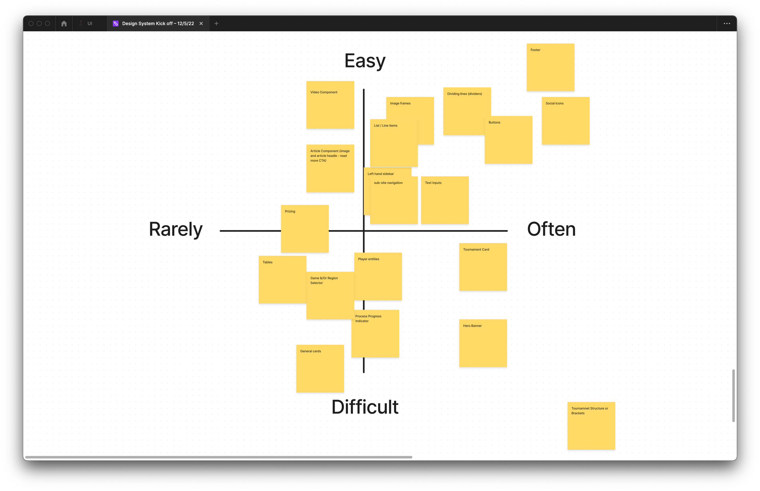
There were some exceptions client-to-client, but this was the rough overall layout. Creating these organisms atomically created a solid baseline for what we wanted Arcade to be.
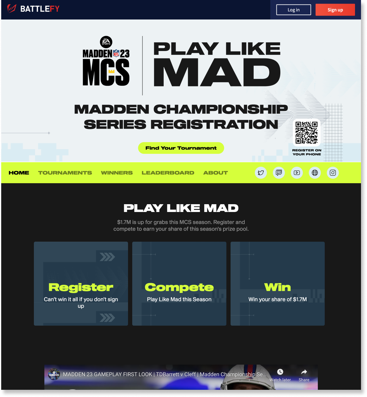
Examples of existing Portal layouts
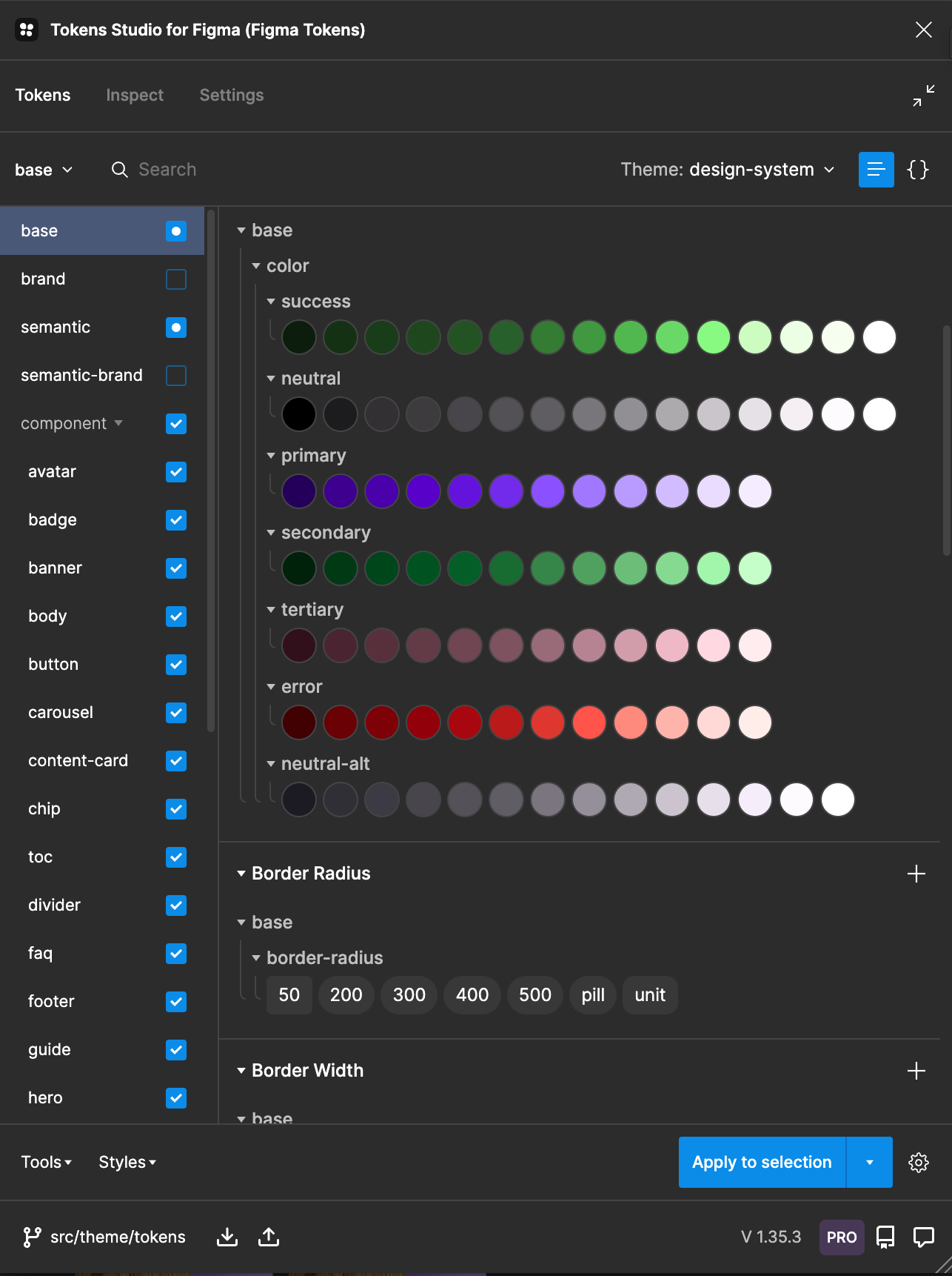
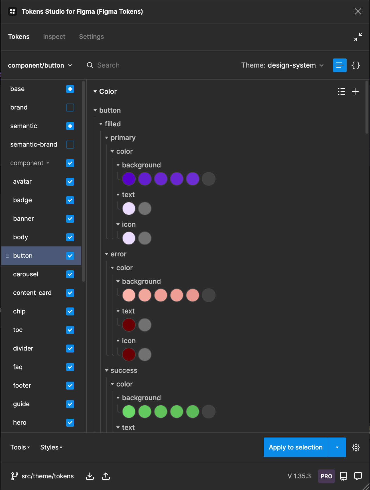
By building within the Token Studio plugin, we were able to quickly convert Figma library data and component details into developer-first items, able to be pulled into Storybook quickly.
(For a detailed view on how we actually built this, click here)
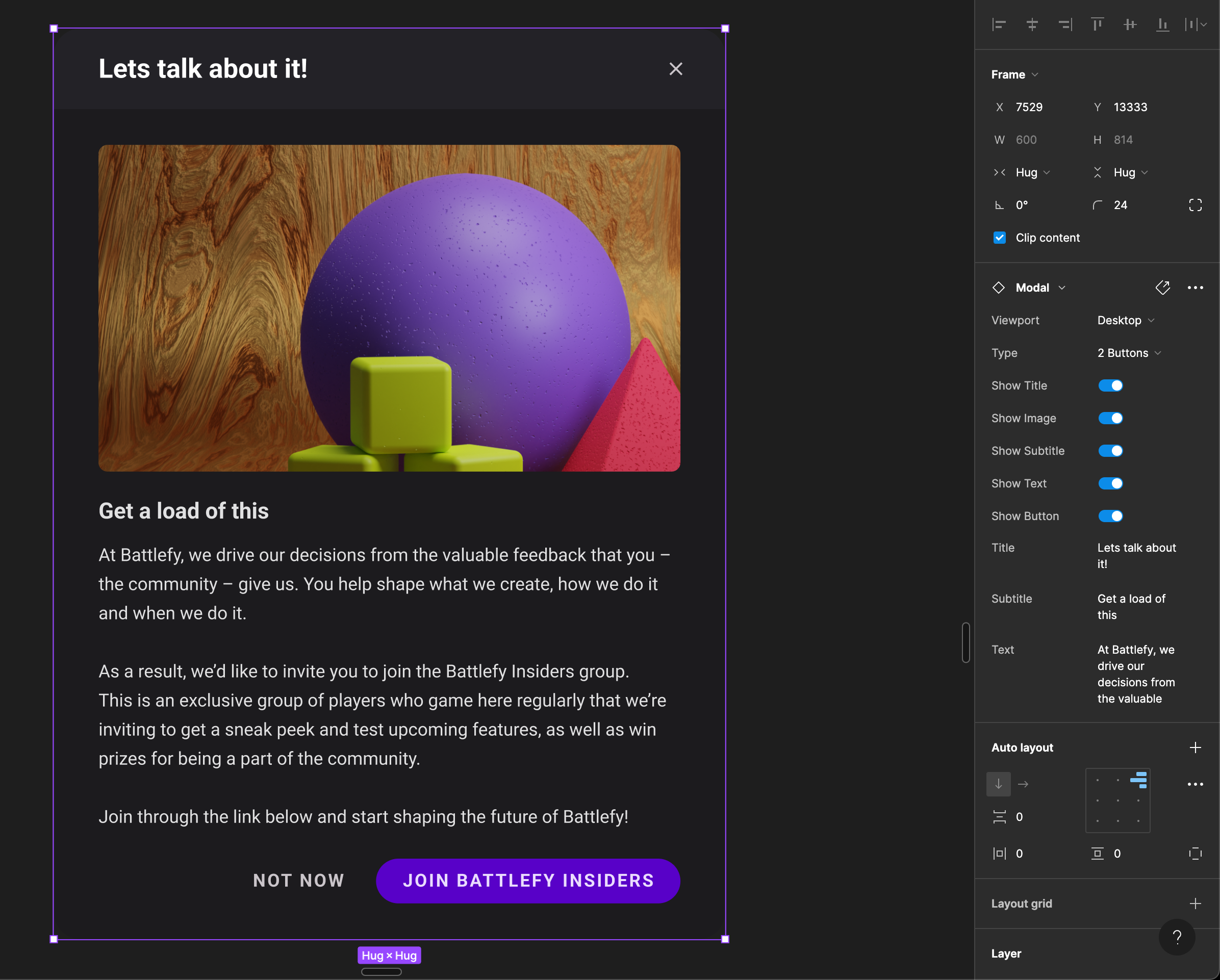
These components were all built out with the abililty to be fully customisable from both a Figma and Storybook perspective.
The Modal component for example had the ability to turn elements on and off, edit text, and change the entire styling through the Token Studio plugin – all without needing to detach the component.
After a few months of work alongside developers and senior members of staff to ensure that what we were created preserved a “Battlefy-feel”, we had a huge suite of components implemented and ready for use on-site built out in Storybook.
After three months, those components are are follows…
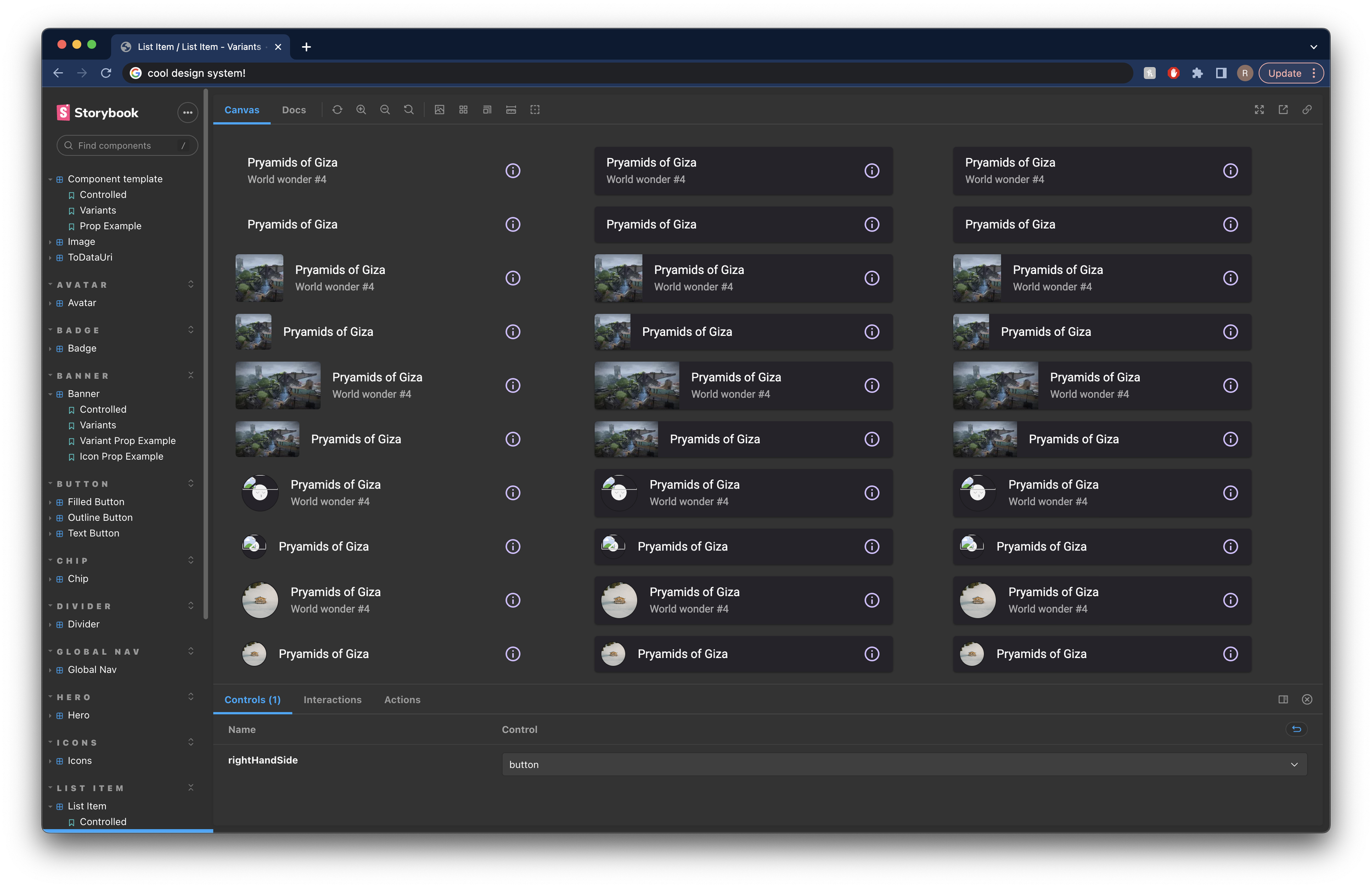
Avatar
Badge
Banner
Button
Content card
Tournament card
Carousel
Checkbox
Chip
Contents
Divider
Dropdown picker
Image
Link
List item
Logos
Menu
Modal
Global nav
Sub nav
Side nav
Notification
FAQ
Footer
Hero
Onboarding
Prizing
Search
Selector
Status
Text block
Text input
Tooltip
Avatar Badge Banner Button Content card Tournament card Carousel Checkbox Chip Contents Divider Dropdown picker Image Link List item Logos Menu Modal Global nav Sub nav Side nav Notification FAQ Footer Hero Onboarding Prizing Search Selector Status Text block Text input Tooltip
Homepage redux
March 2023
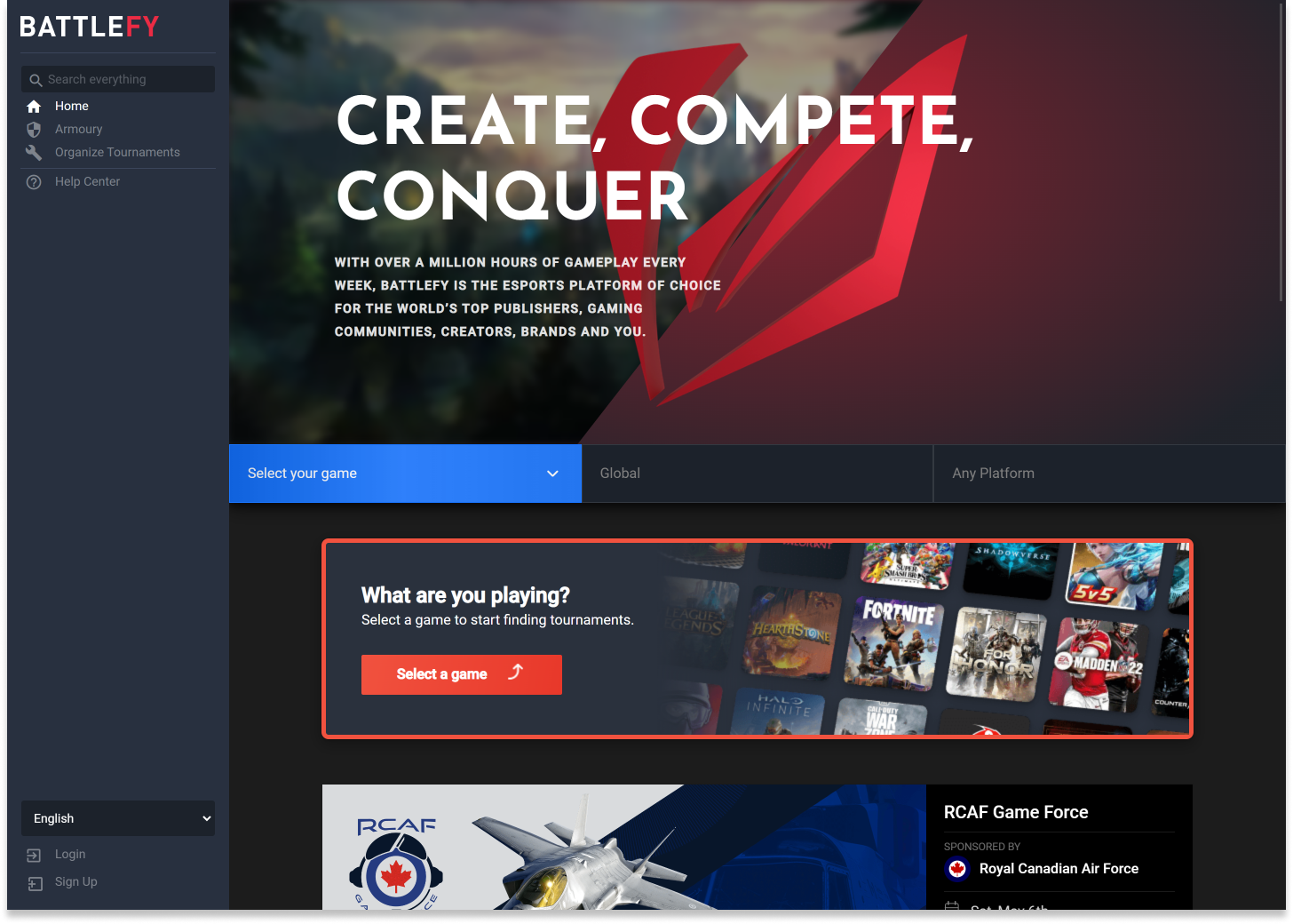
When I joined Battlefy, the homepage was very utilitarian. There was an immediate prompt to choose a game, followed by a carousel of featured tournaments and then a list of other tournaments below that.
In terms of function driving to tournaments, it was effective but for new users, brands and our sales department when liaising with new clients, it failed. There was no explanation as to what Battlefy did, how you engaged with the platform or what we offered potential brands.
Our goal was to improve understanding for our new b2b/b2c users, highlighting the key use cases of Battlefy in an easily digestible way as well as improving sales team conversion rates on new-biz.
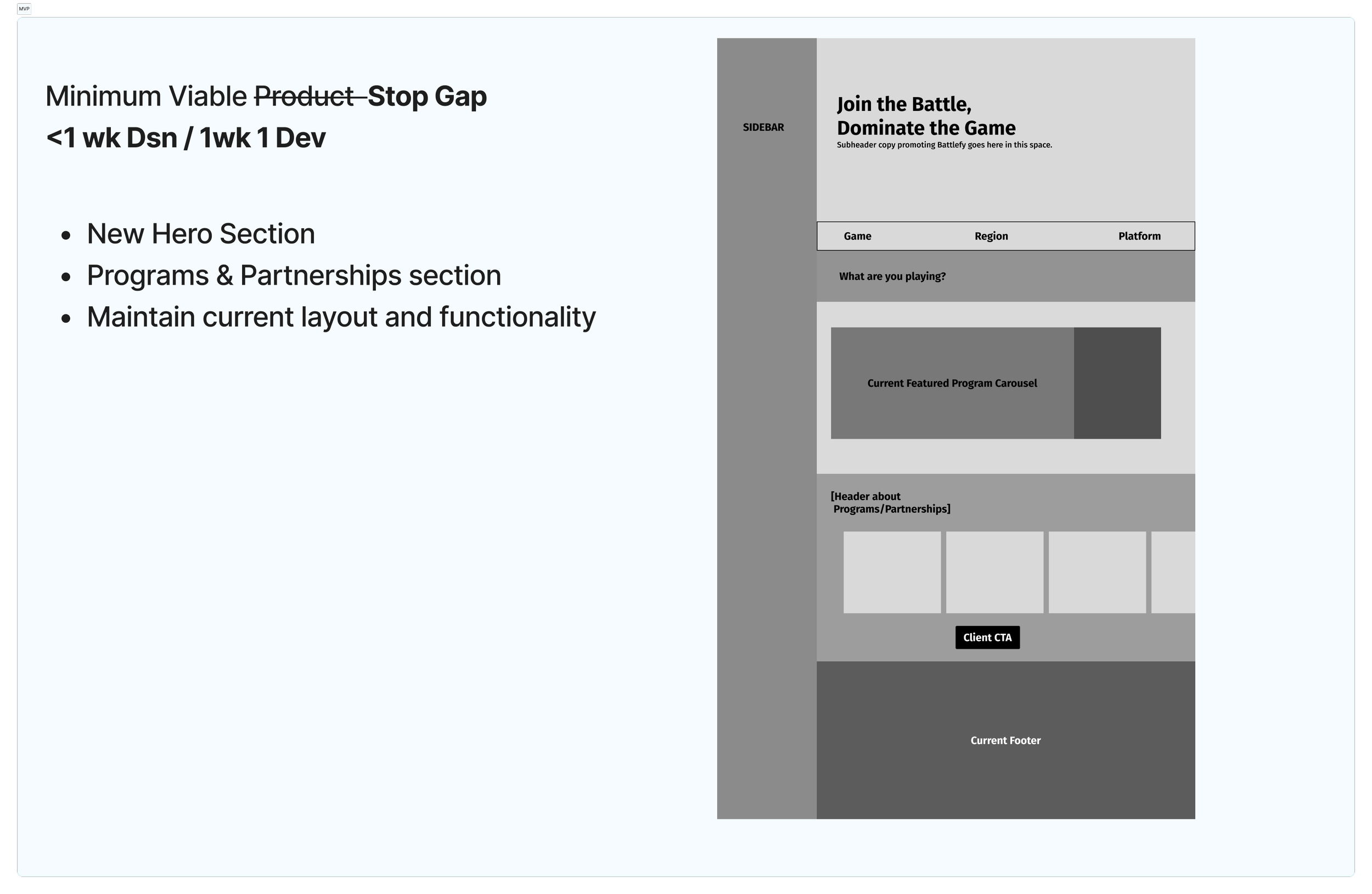
We were initially briefed on a very short time span (two weeks to launch an MVP including both design and development time) which meant we had to prioritise adding key features that highlighted our main uses instead of looking at an entire homepage redesign.
Those key features?
A simple, easy to understand explanation on what Battlefy actually does
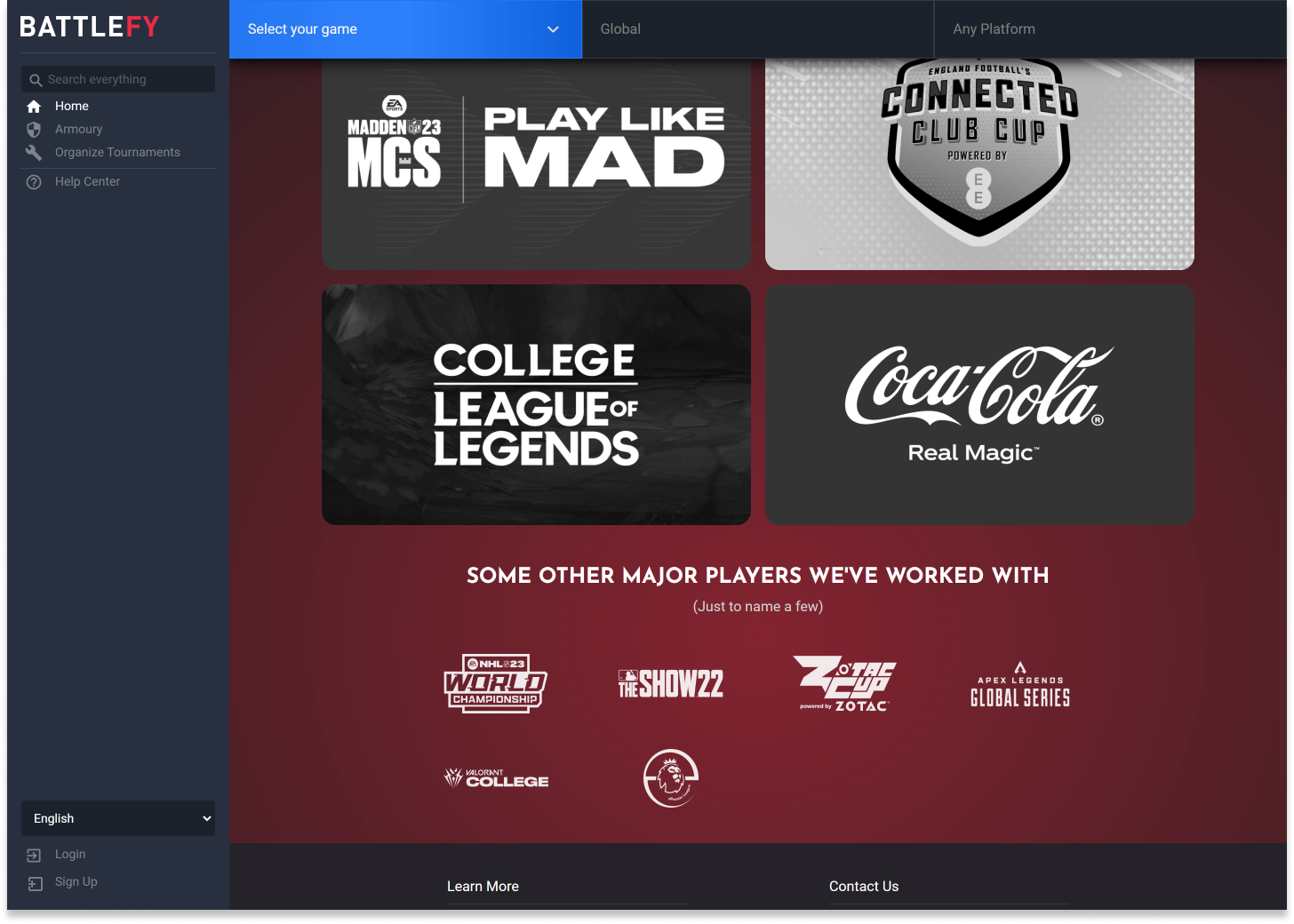
A reel of major partners with work alongside and how we’ve built experiences for them (Riot, Coca-Cola, Madden, Premier League, EE to name a few)
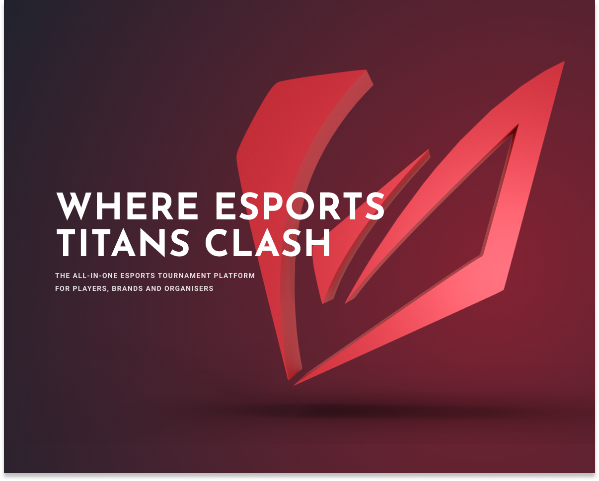
Setting out to change just our hero to begin with, I started doing a few mockups of potential routes we could go down. An element that really struck a chord with stakeholders was the use of 3D assets - something that I’d self-taught myself through the course of this project.
Mixing Figma with Blender let me create some really cool and interesting directions for the new site, as seen below 👇
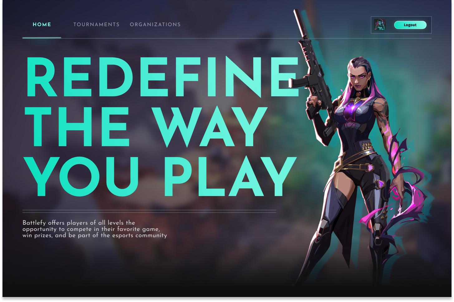


Stage one designs complete and live on the Battlefy Homepage. Links to various Portals used for previously done brand partnerships helped show how Battlefy had previously helped other B2B clients enter the esports world.